Category: Content Marketing

  • 3 Ways to Present Share-Worthy Visual Content

    Content is the reigning king of the marketing world, but the way that content is presented can be instrumental in its success. The most well-written, interesting article won’t do very well if it’s a long block of text. We live in a very visual world, so companies and marketing experts are finding that visual content is actually out-performing its less attractive counterparts. These are three ways you can present your content in a visually stimulating way to appeal to your audience base.
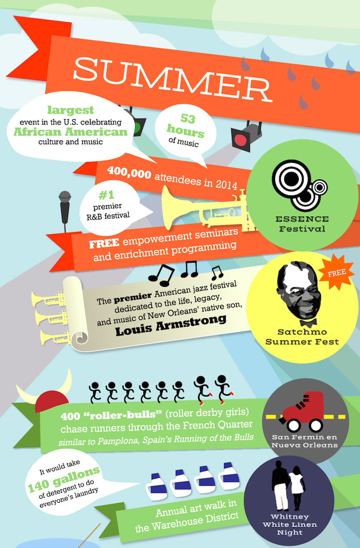
    Infographics

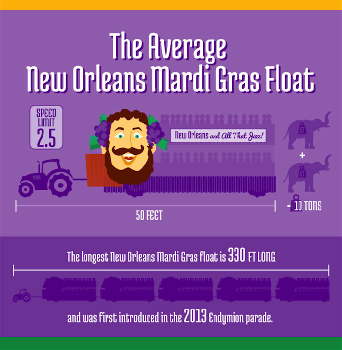
    Studies have shown that infographics can increase traffic to your website or social media accounts by up to 12 percent. These creative tools allow you to convey a lot of information in an attractive, readable way. From charts to illustrated timelines, infographics can be used in a variety of ways in any number of industries. You can present research findings, how-to guides, and even more traditional documents like annual reports in the form of infographics. You’ll find that your audience is far more likely to engage with your content if it’s communicated as visual information, resulting in a broader reach and an easier transfer of data.
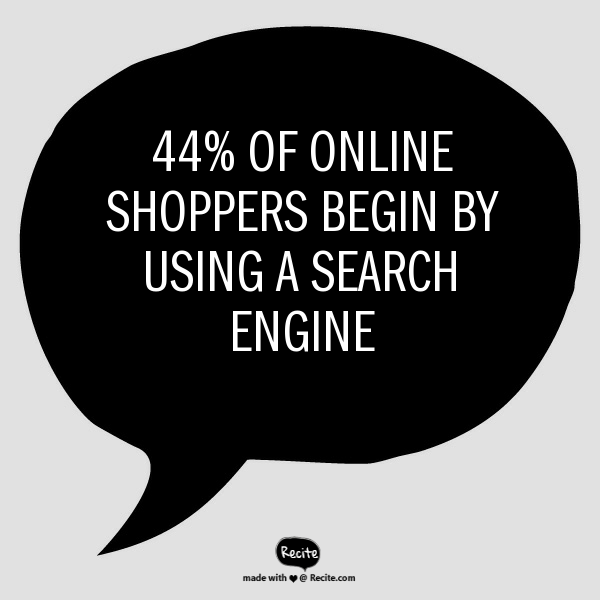
    new orleans festivals 2015 infographic

    Annotated Image

    Annotated images often take the form of inspirational quotes over attractive stock photos, but this media form can actually be used to communicate information. Consider statistics. Statistics are very shareable bits of data, but unfortunately, they’re often presented in a way that isn’t visually appealing. Don’t give your audience a bulleted list—present them with one statistic over a creative, relevant image or background color that matches your branding. These images are easy to digest and share, and they draw attention to your company’s mission without the heavy-handedness of an advertisement. Your annotated images can link to blog posts or internal pages on your website, or they can simply be a part of a series you regularly post to social media.

    Shoppers Searching Image - Search Influence

    Picture-Rich Blog Posts

    The way we blog or post articles has changed at a frighteningly slow pace, and is often counterintuitive to the way readers engage with our content. A tiny picture in the left-hand corner and large blocks of text simply don’t cut it anymore. Redefine the way you think about blogging. Break up your posts with full-sized, sharp images. If you don’t have your own pictures of the subject matter, high-quality stock images can be just as engaging and eye-catching. Shorten your paragraphs to a sentence or two, and use bold text to emphasize numbers and statistics. Simply put, make your blog posts highly visual and easily scan-able.

    By sharing information as an infographic, annotated image, or a photo-heavy blog post or article, you can outplay the average consumer’s waning attention span. If your content is great, present it in a way that will be noticed.

    Image source:

    Premier Allergy

  • Healthy Content: 4 Tips to Drive Conversions in the Medical Industry

    Healthy Content Marketing Image - Search Influence

    In the medical and plastic surgery industries, it can be hard to get past the medical jargon and engage with readers online. But despite these challenges, building up an online presence is vital in this day and age. Everyone online wants to gather information quickly, and they seek immediate gratification when it comes to scheduling appointments and learning about procedures. To keep their interest, you have to present your content in a user-friendly, engaging and attractive way. Let go of the olden days of long-winded explanations and paragraphs upon paragraphs of medical terminology that no one can understand. Step into the 21st Century with these four types of content:

    1. Infographics

    We all want something that is nice to look at and easy to understand. Infographics are not only engaging, but they can also be super informative! The medical terminology that your current and prospective patients need to know can be easily explained in shorter phrases and pictures or guidelines. Infographics help your patients connect with you and your practice.

    Infographics are also more likely to be shared by your customers. People love sharing fun and interesting infographics on their own social media pages, so this will ensure more conversions and potential new clients! Find out more about how infographics can give your content marketing strategy a facelift.

    2. Videos

    Videos are another great visual way to engage your website visitors. You could explain your processes and surgical procedures easily without scaring visitors off with long, complicated paragraphs. This is also a great way to introduce yourself and your practice to potential patients.

    You don’t have to do a stand-up; you could make a slideshow video with voiceover narration, or if your budget allows, an animated video. Make sure you include a call to action at the end so the viewer can take the next step in becoming a patient!

    3. Lists

    Lists are great. You’re reading one now! Putting the number of listed items in the title is especially helpful so people know exactly what they’re getting into. Readers are more likely to click through and take the time to read if there are 10 or fewer items. They’ll think it will only take a couple of minutes, then BAM! They’re hooked. They’re converting, and they’re your next patient!

    Make sure to write lists that are interesting and preferably not common knowledge, such as “10 Things You Didn’t Know about ____” or “5 Ways to Look Younger Without Surgery.” You could even promote your products or services with a list of great products for this, that, or the other thing. Keep it short, sweet, and to the point.

    4. Guides

    Because you specialize in a certain medical field, you have knowledge that is credible, useful, and interesting. Write it down! Guides can be about absolutely anything, and they’re excellent sharing material for those who want to stay informed and keep their social media followers/friends informed. For an example, check out the Search Influence guide on how your online presence can win and lose patients.

    An excellent way to drive up conversions is to make your guide a downloadable file and request information from the reader before they can download. This allows you to add them to your email newsletter list, which will make them more likely to become a patient in the future.

    Deciding how you want to present yourself online can be time-consuming and frustrating, but these four winning types of content are fun, engaging, and can help your conversion rates. Play around with some ideas and be sure to use different content on different pages to keep people wanting more!

    Interested in more content marketing tips for medical marketing? See how natural content can help your practice’s website attract patients.


  • Show Me An Infographic, Mister! New Orleans’ Unique Content Marketing Approach

    There’s definitely a story behind New Orleans—the city of festivals. And it’s an insider story you likely haven’t seen online before. For example, what New Orleans tradition includes 822 floats and is 21,000 riders strong? What celebration features more than 130 pyramids of burning logs? When it comes to content marketing, New Orleans gives tourists and locals alike reasons to share the kind of fun, behind-the-scenes information that makes the Big Easy one of the world’s most fascinating cities. In a city steeped with so much history and culture, infographics are helping to bring some of the key celebrations—such as the recent New Orleans Jazz & Heritage Festival and Mardi Gras—to life through visual storytelling.

    A City of Festivals Comes to Life

    The New Orleans Tourism Marketing Corporation enlisted the help of Search Influence and its creative infographics team to reinforce the city as a year-round destination where there’s always something happening. Yes, it’s true: there’s virtually always a parade, festival, second line, or other event every week. And along with the big-name festivals like the New Orleans Jazz & Heritage Festival, French Quarter Fest, Essence Music Fest and Voodoo Festival, there are many other celebrations that lend to the city’s reputation for being among the most diverse festival cities in the world.

    In fact, New Orleans is deep in its festival season now, and this infographic gives the story in eye-catching detail—in a way that just plain old written content can’t match. Check out the part that describes summer festivals in New Orleans:

    new orleans festivals 2015 infographic

    See the Magic of Legendary Mardi Gras

    This February, another Search Influence-produced infographic detailing the legendary New Orleans Carnival—a tradition that dates back to the city’s first Mardi Gras parade in 1837—helped bring renewed interest among people that visited the official New Orleans tourism guide website. While visitors to the website typically spend an average of two minutes browsing, visitors to the Mardi Gras infographic page were spending upwards of eight minutes reading the content. On social media, the infographic was shared more than 700 times on Facebook and Twitter. In fact, the infographic received 6,000 views in its first week. Here’s a glimpse of part of the infographic:

    Infographic Content Marketing Image Search Influence

    What Makes a Good Infographic?

    While content marketing is certainly taking off in New Orleans with lots of local flavor mixed in, all businesses—no Jazz Fest or Mardi Gras required—can learn infographic best practices from these New Orleans examples.

    When crafting an infographic, follow these four tips:

    • Include impressive or interesting statistics that draw readers’ engagement. For example, the average Mardi Gras float in New Orleans is 50 feet long and weighs 10 tons—the weight of two elephants!
    • Make sure the infographic is very graphics heavy. Include images and charts to show your audience the story. That streetcar with “Stellaaaaa” amplified by a megaphone really illustrates the best-loved play that pays tribute to one event: the Tennessee Williams New Orleans Literary Festival.
    • Include an element of usefulness. For example, with more than 70 different parades during the Carnival Season, it can be hard to keep track and determine which ones to attend. For example, the handy “Noteworthy Parades” section of the Mardi Gras infographic doubles as a useful calendar, and the key to the festivals infographic, for example, is to showcase the festival—or multiple festivals!—for every season theme.
    • To finish, craft all of your data and graphics into a visually appealing design. The Mardi Gras infographic, for example, makes use of the vibrant and traditional purple, green, and gold colors as well as a few bold fonts to form an appealing connection between all of the information.

    With these tips on creating the best infographic, keep in mind that the goal with this graphical content is typically to generate website traffic, backlinks, and social shares. And with Facebook and other social media sites putting more and more focus on visual content, it is a safe bet that infographics are not dead. In fact, these Big Easy examples demonstrate further that infographics should be a part of a company’s content marketing strategy.


  • Give Content a Natural Glow: Medical Marketing Makes the Switch to Natural Content

    Content marketing natural glow image - Search Influence

    Back in the early days of search engine optimization, there were a lot of shady practices that were less than ideal for site visitors. Keyword-stuffing, spammy tweets, backlink schemes, and useless content were often the norm, as these tactics helped websites climb the ranks of the search engine results page. With content more focused on algorithms than the audience, many websites scared off potential users. While some of these tactics have been left firmly in the past, many SEO strategies still optimize for Google bots instead of users. This is especially true when it comes to geo-modified keywords in healthcare marketing (think “plastic surgeon new orleans”), which continue to make many pages feel stuffy and awkward.

    Of course, letting go of geo-modified keywords can seem like a hard pill to swallow—especially for those in highly competitive fields such as the plastic surgery industry, where medical practices are constantly battling for the top spots in a Google search. “Going natural” when it comes to content might seem like an overwhelming change at first, but the benefits to your patients and your practice make it a worthwhile strategy in the long run.

    Content is King

    So what do we have when we eliminate all the spam? Natural content. Google rewards sites that provide better user experiences, relevant information, and quality content—those with high click-through rates, low bounce rates, and long time-on-site—with better overall rankings.

    What’s more, all of the updates to Google’s algorithm have made the search giant incredibly advanced, and you might be surprised by some of the astonishing leaps it can make. A search engine results page might pull up one or more high-ranking pages that never actually include the words a user originally entered as a query. For example, a search for “breast implants new orleans” might return pages that never actually use this exact term. Highly relevant pages on “breast augmentation” might rank higher in a Google search than irrelevant, keyword-stuffed pages. What does all this mean? Google’s smarter than you thought.

    Interested in more content marketing strategies for your website? Find out how infographics can give your online strategy a facelift.

    It’s All About the Audience

    As its name suggests, SEO has always focused on search engine optimization—but the best way to earn trust from your patients is to focus on your patients. Forget trying to keep up with algorithm changes: Google’s updates are always centered around providing a better user experience, so why not focus on that as well?

    Spammy, keyword-stuffed content isn’t doing your patients any favors. Visitors to your site can see through the awkward “fluff” content, and they’ll abandon it to find content that actually answers their questions and meets their needs. Sites with overly optimized content tend to see higher bounce rates and less time spent on the site overall.

    Protection Against Algorithm Updates

    Beyond the fact that you’re losing your human visitors by focusing your content on the needs of Google bots, you also hurt yourself with this approach. Overly optimized content is vulnerable to every new update to Google’s algorithm. Well-written natural content, on the other hand, won’t need any of the major edits that spammy content will regularly require. Content that is relevant to the needs of your patients will always be useful—and Google’s algorithm can see that without your help. If you need help determining whether your website content will pass the Google test, fill out the short form on our homepage to sign up for a free website analysis.

    Search Intent Optimization

    At the end of the day, your potential patients are looking for something, and it’s your job to figure out what. Maybe they need help to become informed about a procedure they’re considering, maybe they’re weighing the pros and cons of several medical options, or maybe they know what they need and are searching for a trustworthy practice in the area.

    Whatever the case, you’ll need to do your research. Figure out what they consider useful and decide how you can use unique and creative content to solve their problems. Patients will be able to see the value in content that gives them the answers they need, and they’ll trust the information more if it doesn’t seem awkward or spammy. Go from there to build your relationship with them—rather than building a relationship with an algorithm.

    If you’re ready to take the dive into offering patients more natural content, but you’re not sure where to start, let us know how we can help! Interested in the ins-and-outs of search engine optimization for the medical industry? Check out our tips on the art of “Googleplasty.”

  • How Infographics Can Give Your Online Strategy a Facelift

    Infographics Facelift Image - Search Influence

    No industry knows the importance of image more than plastic surgery. Before and after pictures are worth a thousand words, and prospective patients heavily rely on visual information derived from those pictures when deciding which cosmetic procedures to explore. However, plastic surgery websites do not have to restrict themselves to just pre- and post-op imagery.

    Introducing Infographics

    Simply put, infographics are images that visualize information or data in a compelling, creative, and colorful way.

    Businesses are increasingly turning to infographics to present their industry contributions. For example, Web company Unbounce, estimates that the use of infographics has seen a huge surge in recent years—an 800 percent increase from 2010 to 2012. Research conducted by AnsonAlex, a tech company specializing in producing tutorials, found that publishers with ample infographics grow website traffic 12 percent faster than those with no infographics.

    Infographics are clearly more than a passing trend; they are a strategic marketing opportunities upon which the plastic surgery industry can capitalize.

    Infographics Make Eye-Catching Websites

    If you are looking for a new way to promote your plastic surgery clinic’s webpage, infographics are a surefire strategy for keeping eyeballs glued to your site. A single infographic has the potential to reach as many as 15 million Internet users through web searches, according to an infographic by Top Marketing Schools.  In fact, searching ‘plastic surgery infographic’ yields 283,000 results on Google. Create and post infographics on your site to take advantage of this pool of interested users.

    The average page visit lasts under a minute, but an infographic can keep a user reading for longer. In fact, a Search Influence-produced infographic detailing the legendary New Orleans Mardi Gras renewed interest among people that visited the official New Orleans tourism guide website. While visitors to the website typically spend an average of two minutes browsing, visitors to the Mardi Gras infographic page were spending upwards of eight minutes.

    Infographic Content Marketing Image Search Influence

    Ninety percent of the information processed by our brains is visual, so it’s only logical that we are more drawn to vibrant images than walls of text. Readers are likely to skim the infographic, absorb the information, and then explore the site further to learn what else you have to offer.

    Be sure to add some written content outside the graphic. Site crawlers cannot scan images, so your optimized content must also appear elsewhere on the page in order to attract search engine hits.

    To keep your users on your website, it is vital that your infographic loads quickly! The average user expects a page to load in under three seconds and will not hesitate to close a window that does not deliver fast enough. The quicker your site loads, the better your conversion rates will be.

    Infographics Boost Social Media Reach

    Your plastic surgery clinic can also use infographics to attract more social media followers and shares. That’s because images perform well on Twitter—even better than videos! For example, images get 128 percent more retweets than video tweets, according to Quicksprout. Similar to web pages, our eyes are instinctively drawn to tweets with alluring images.

    To properly post your infographic on social media, however, you have to make sure it is shareable and easily traced back to your site. Use an embed code in the infographic so other industry professionals can easily add it to their sites. On the graphic, place your website address and the name of your clinic in bold letters. If your link or commentary is deleted through sharing, your clinic name will still remain. Using easy share links such as ow.ly or bit.ly can also make it easier to share on Twitter, Facebook, and Pinterest.

  • #LocalUp – Making Content The Sexy Part of Social

    The presentation below was developed for a joint conference put on by Local University and Moz in Seattle on February 7th, 2015, called LocalUp.

    My “beat” if you will as a Local U faculty member is Social Media, and given our work with customers of Search Influence, I have always leaned toward the advertising side of Social Media Marketing. With some of the changes being made by Facebook, most particularly, the elimination of “selling” content from the news feed, that focus is getting more important.

    Facebook is no longer a free lunch. You’ve got to pay to play.

    That said, it’s still very important to build community and engagement and good content makes it easier. That’s what this presentation is about. I hope you enjoy. I’d love to have your comments here or on SlideShare.

  • Gmail Reveals Its Hottest Secrets (Part 2)

    I wrote a blog post about a week ago about several hidden, secret features in GMail. Most of that was about organizing your inbox. This post is more about the secrets and great features you can use as you are writing emails. Let me know if you have any additional helpful features in the comments below!

    (numbers 1-5 in part 1 of this series)

    6. Canned Responses

    Do you find yourself composing the same email several times a day? If so, you should enable canned responses. Canned responses are drafts or email templates that you can save in your settings when you go to compose a new message. They will not show up automatically, so you need to go to the Labs in the settings of GMail, and enable this feature. There will be an arrow at the bottom right of a new message, and that is where you will find the feature once it has been enabled. This saves so much time for me and my colleagues, so I highly recommend it.

    01-CannedResponses

    CannedResponse

    7. Reply from the same address the message was sent to

    If you have multiple email addresses you use in your workplace, it’s important to make sure that you reply with the appropriate email. When I compose an email, I have to switch the email address of who it is coming from (which also changes my email signature). However, you can automatically set it so that when you press reply on an email thread, it replies from the email address the original email was sent to.


    03-SendMailAs

    04-NewMessageFrom


    8. Undo Send

    Have you ever forgotten to include something in an email?  Attach something? Sent an email to the wrong person? Misspelled something? Addressed the wrong person? (that one’s really bad)!

    THIS SETTING IS A LIFE SAVER!!

    It can be enabled under the General settings. You can select how long you have to undo a message once you press the send button. I have selected up to 30 seconds, which is the longest time possible. Once you send an email, you’ll get a notification at the top of your email account saying you can undo send or see the message you just sent. Please note that this is the only place where you will be able to undo the send. If you archive the message, click to your inbox, or somewhere else within GMail, the undo send option will not be available.

    05-UndoSend

    06-UndoSendAlert

    9.Boomerang

    Boomerang is a great tool to use for scheduling emails and following up with people. Often, I work late nights, but I don’t want to send emails that late mainly so the person who receives it won’t know I work until 9:00 at night. I can compose an email and schedule it to be sent anytime in the future. You can also set it to “boomerang” back into your inbox if someone does not reply or open the email you sent. You also have the ability to manage and edit any of your scheduled messages. Boomerang allows you to schedule or return up to 10 messages per month. If you find yourself needing it more than that, there is a subscription available for purchase.

    07-SpecificSendTime

    08-BoomerangSettings

    10. Rapportive

    Rapportive is a feature that shows information about your contacts right in your inbox. They “combine what you know, what your organization knows, and what the web knows,” to display this information in the right sidebar of your email. I like this because it’s an easy way to connect with those people on social media (ie: put your great stalking tendencies to work 😉

    09-Rapportive

  • The Secret Life of Gmail (Part 1)

    Part of my everyday is sorting through ~150 emails, which can be quite taxing if you don’t have a good system in place. We use GMail for our email system at SI. I know most small businesses probably have their email system already figured out, but if you don’t, I would HIGHLY RECOMMEND using GMail as it has lots and lots of great features that make emailing less painful. I have learned some great tricks offered within Gmail- far too many for just one blog post. This first post is about organizing and archiving your email account. Part two will be geared towards writing and scheduling emails. I hope you find this helpful!

    1. Priority Inboxes

    Priority inboxes are a great way to organize your inbox if you have trouble figuring out what’s important and what is actually relevant to you. This setting is very customizable, and you can set the number of emails you wish to see or have visible per section. I have mine set up as Important and Unread, Important, and Everything Else. Important and unread is exactly what it says- all messages that are marked as important or all messages that are unread. Important is everything that I have read and marked as important, but I haven’t necessarily responded to or handled the particular issue yet. Everything else is compilation of things I just need to file away or delete (because they’re not applicable to me).

    GmailSettings

    2. Important Arrows

    These are great in combination with the Priority Inbox. If you use these, Google will start to learn what is and is not  important to you. It will learn to sort them in the priority inboxes accordingly.  When I get an email in my Important and Unread, Google knows to put it there because it has the important arrow. If I receive an email in my Important and Unread section that is actually not applicable to me, I uncheck the arrow. That way, the next time I get a similar email (with that same subject or from that same person), Google puts it in my Everything Else inbox. It works the other way too- if I see something in my Everything Else Inbox is actually important, I put the important arrow with it, and Google moves it into my Important and Unread Inbox. It learns these habits over time, so your Inbox for the most part really does become organized.

    Gmail-Inbox

    3. Filters

    Do you find yourself receiving emails that you don’t ever need to read or open? We get emails from our CRM system all the time, but I never look at them because, frankly, I receive way too many other emails a day that are much more important. So, I have set up a filter so the emails I receive from that recipient are automatically filed away into my “CRM” folder. They never actually show up in my inbox! To set up a filter, go to settings, filters, and then create new filter at the bottom. You can perform a search function by email recipient addressed to you with a certain subject line, etc. You can set it so GMail will either automatically apply a label or archive it into the folder you have identified. This will save a lot of filing time if you have emails similar to this coming to you everyday.

    GmailFilters

    4. Unread Messages Icon

    This is a Lab in the settings. If you’re like me and you leave your email open all day in a tab (I know I shouldn’t, but hey- we all have our vices), you can enable this feature so you can monitor your email as you are working on other tasks. My recommendation is if you get more than 10 new messages, you should probably hop back over to your email just to check and make sure nothing SUPER important needs to be tended to.

    GmailInboxTab

    5. Mute Button

    This is a great feature that you can use to mute conversations if they keep popping up in your inbox. I get a lot of emails that are not related to me, so I often put a “Not Mine” label on them. If that same conversation pops up again in my inbox, I’ll see the “Not Mine” label on it, realize that it is not for me, and press the mute button. This will make it so if anyone else responds on this email strand, the conversation will no longer come to my inbox, but it will stay filed away in its folder. BRILLIANT STUFF HERE!

    Gmail-MuteEmail

  • Why I Hate Your Website: A Guide to Good Web Content

    Hopefully you’ve read some of our other great blogs on sharable content and you’re sending out all those valuable signals that lead people back to your website. These leads are great and all, but what good are great signals and roadmaps if they lead you to something… disappointing?

    Imagine your favorite childhood adventure movie: A six-pack set of friends, perhaps accompanied by a talking animal of some sort, follow the strange, convoluted clues of an ancient map they found in someone’s grandfather’s attic. What if these young adventurers followed this map to the very end only to find a great big chest full of nothing?

    HeavilyGuardedContent

    That would be the worst movie ever.

    So, just to clarify, your website is that chest, and you’ll want to make sure that there’s some treasure up in there. How? Treasure = good content.

    Sidenote: I recently heard an interview on NPR with Pixar Animation Studio’s president Ed Catmull that relates to this topic. The interview was introduced with “content is king” so, you know I was tuned in. In the interview, Catmull downplayed the importance of technology in Pixar’s movies. “It’s not about the technology,” he says.  “We use the technology, we develop it, we love it, [but] it’s about the story.” So, if Pixar believes in content, you should too!

    So, what makes good web content?

    From a broad perspective, here are four characteristics that can guide you to good content.

    Infographic

    Useful

    Your viewers have jumped down the rabbit hole in search for something. It’s your job to know what that something is. Have they arrived at this page looking for contact information? For pricing? To make a purchase? — Make sure you know why the viewer has made it to this point. Then, and only then, can you provide the solution.

    Be as detailed as possible, but also be concise. My number 1 rule: no fluff. Aaron Wall of SEOBook puts it perfectly, “Good writing does not add extra words for the sake of word count. Each word carries purpose and meaning.”

    Clear

    Make it easy for your visitors to find what it is they are looking for. Your site should not be iSpy, Contact Info Edition. Organization of your content is paramount. The longer your visitors have to search for information, the more likely they are to jump to another site. Make the information easy to skim.

    ispy-meme

    A major issue I see is vanity capitalization. If the intent is to highlight important information, the tactic has the opposite effect. With so many Capitalized words throughout the Content, it becomes Unclear why You are Capitalizing anything at all? See how difficult it was to read that one sentence? Capitalize words within your subheadings, headings, navigation bars, etc. all you like, but don’t go cap-crazy within your content. Sending too many signals to your reader that THIS or THIS or THIS or THIS and THAT are important throughout your page can become confusing. If everything is important, nothing is important.

    Pro Tip: Subheadings are a great way to point your site visitor in the right direction. But don’t go overboard.

    Unique

    Duplicate content is something I see a lot of. It’s not just a personal pet peeve; it’s bad for SEO. So, don’t fill out multiple pages with the same content just for the sake of having multiple pages. Not only is this confusing for your site visitors, but it is confusing for search engine crawlers as well. So, you’d think if it’s bad for your viewers and it’s bad for your ranking, people wouldn’t do it. However, you’d be surprised how many sites I see with duplicate content on top of duplicate content. Make sure each page has content unique to that section. If the two pages are too similar, find a way to combine them. Otherwise, reword things to show the unique purpose and perspective of that specific page.

    Accurate

    Make sure your hours of operation, your address, your pricing, promotional deals – any information that may fluctuate – is up-to-date. The more active you are on updating your site’s information, the more accurate your site will be. This is not only good for your visitors, but good for search engines. Being up-to-date on information makes you a more reliable source.

    I can’t count how many times I’ve wondered if a site was open on a particular day—whether it was due to an obscure holiday (Hey, it’s New Orleans, places close their doors for seemingly no reason whatsoever), or due to conflicting information—and their site was anything but helpful. Letting your site visitors know what’s what ultimately gives them the information they need to be customers. And that’s the point, isn’t it?

    Whether you’re adjusting old content or starting from scratch, think from the perspective of your site visitors. It’s also good practice to examine the sites you visit frequently. What are some frustrating aspects of navigating the site? What is some information you wish they displayed? The key aspects of good content are all around you, take note of them! Observing the successful (and less successful) aspects of other sites, whether they are related to your industry or not, can help you navigate your own site’s content.

    So, how about it? What are some examples of good content that you see on a regular basis?

    GoogleSearch

  • Content: The Beginning

    In the beginning there was the Internet.

    At least, that’s what I tell myself when I try to think back to my early childhood. Kids (whatever, I’m a kid, kids younger than me) are glued to smart phones, they have these things called tablets and nooks… but what of books? What of literature? These are some of the questions people had about television back when the youths first sat their little rumps down in front of the tube. Now, the eye of Sauron has turned to the Internet.

    internet.gif

    Don’t get me wrong, the Internet is chock-full of copious amounts of information (all the information, in my opinion—if it’s not on the Internet, it doesn’t exist) and can be extremely useful. Ah, but therein lies the issue!

    The Internet is an extremely powerful thing, a great source for random, trivial, and (sometimes) useful knowledge. However, with great power comes great responsibility. Although many can argue that the Internet is killing language (lik3 wut3v3r dude), excusing poor spelling, grammar, and vocabulary, the Internet has also bred a whole new generation of nit-picky grammar specialists. You know who I am talking about, that one person who loves to correct your use of words, followed by a sweet, misleading asterisk.

    What am I getting at?

    hercmeme.jpg

    Although a lot of time goes into straightening out the aesthetic and function of websites, many forget to think about the words.

    To quote the great V, “Words will always retain their power. Words offer the means to meaning, and for those who will listen, the enunciation of truth.”

    However, choosing those words can be a difficult, sometimes even Herculean, task. On the one hand, your content needs to be purposefully crafted, tailoring to those aforementioned language *specialists*, but on the other hand, your content needs to be clear, concise, and easily understood by a diverse audience, i.e. everyone.

    Good Content = Good SEO

    But how do I write good content? You may ask. Obviously, content will vary depending on your site, your brand, and your audience. But, say we were to tackle “good” content on a broad scale

    Check back for my next blog where I break down the concept of content, starting first with: The What — What Your Content Needs To Say.