Blog

  • The Final Countdown: Secure Your Website to Align With Google’s Update to Chrome

    Is your website safe from google's not secure warning - Search Influence

    The year is almost over, October is finally upon us, and if you’re wondering what you should be checking off of your business plan “to-do list,” then you should definitely place priority on reviewing the security of your website.

    Starting this month, Google will officially be letting your visitors know if your site isn’t secure for them to navigate.

    This shouldn’t come as a surprise, since Google announced its intentions back in 2014. But nonetheless, the time to take action is now. Here’s what you should be looking for in order to avoid Google showcasing security warnings to your visitors and potential customers.

    Image of an HTTPS secure site - Search Influence

    Are You Talking to Me?

    A secure site means your site has received an SSL Certificate. SLL uses HTTPS (Hypertext Transfer Protocol Secure) servers to encrypt and store information given on the site. Here’s more detailed information from Google about HTTPS servers. Not only do they provide an assurance for your visitors by securing any information they provide through a form fill like credit card details, but Google also announced that HTTPS is a ranking factor, even if not a huge one.

    So, how can you tell if your site is secure? One the easiest ways is to open an incognito window and look at your site’s URL in the search bar. Does it read  “Secure|HTTPS”? If so, then you’re good to go. If you attempt to input any information in a field on your site and “not secure” reads at the start of your URL, then that means your site is not secure and you will need to contact your web developer, web host, or attempt the switch to a secure site yourself. Google made a handy GIF displaying what this would look like for users.

    Search bar from Google Site - Search Influence

    Is It Too Late to Secure My Site?

    Google’s update to how it displays unsecured sites in Chrome is slated for release around October 24. If you have already earned an SSL Certificate for your site, then kudos to you. But, it’s never too late to switch your site to HTTPS.

    Jared Jones, one of our technical web developers, wrote a detailed blog post about the importance of having a secure site, steps you can take to switch to HTTPS, and reasons why it may affect your site’s speed and your overall ROI. If you’re thinking of tackling the project yourself, this post is a great start.

    Google plans to announce future changes to increase site security, like displaying “not secure” for all HTTP pages, not just those in incognito mode. But, it’s safe to say that making this simple change will increase the trust of visitors to your site, leading to a higher return rate for your business. Contact our team of experts—we can help you make the switch today.

    Here are some options:

    1. Do it yourself or with your developer or website company, with caution.

    Beware, not all SSL Certificates are created equal. Be sure the provider of the SSL Certificate is Google approved. purchasing an SSL Certificate, configuration at the server level is required for set up as well as ongoing maintenance. The process must be repeated each time it expires.

    Once the SSL Certificate is purchased, it must be configured at the server level in order to complete setup. Ongoing maintenance is also required, and the process must be repeated each time it expires. When you update your URLs to HTTPS, you must also implement proper 301 redirects and all your assets must be addressed when moving.

    2. Let us take care of it for you!

    We’ve developed an easier-to-maintain alternative for our clients that fully addresses redirects and website assets, setting you up better for the long term.

    If you are a current client, we’ve already reached out to you about moving over.

    If you are not a Search Influence client, reach out to us so we can discuss helping you!


    Images:

    Google GIF

  • How Patients Are Searching for Doctors Online: Make It Easier for Them to Find You

    The digital world has infiltrated every facet of our lives, including our health care. Yet, many physicians don’t know how to best compete in this online marketplace. The sheer amount of information on the internet has empowered patients to choose physicians with discretion and change care providers if they don’t have a good experience.

    By placing your clinic’s online presence in the same digital spaces that your potential patients occupy, you can increase the likelihood that they’ll choose you for their next appointment.

    Help Them Find Their Diagnosis

    Patients come into an appointment with a pretty robust working knowledge of all the possible rare tropical diseases they could have and a comprehensive list of all side effects of each potential treatment. How do they have all of this information? They Googled it.

    While some people still go straight to their mom, most first enter their symptoms into a search engine or medical-focused portal like WebMD. They investigate all the possible causes of the symptoms, available treatment options, and further advice on what kind of care they should seek. By creating content that answers these questions, you can position yourself as an authority on the subject and build trust with the readers.

    Claim Your Listings

    Once people have a good idea of what could be wrong with them and what kind of medical care they need, they might not immediately make an appointment. Instead, they may return to search engines to do further research. They search facilities and doctors nearby, check to see which providers are in their insurance network, and read reviews. This chart from Gravitate shows some of the queries people are searching.

    Having information about specializations, board certifications, awards, presented papers, and other selling points on your website is useful, but often patients are looking at third-party sites like Healthgrades for reviews from other patients. You only have control over the content of your website, but if you claim your listings on some of these sites, you can update them to have an up-to-date address and phone number, a link to your website, a list of current physicians and specialties, and even responses to negative reviews.

    For help claiming your listings or other healthcare marketing services, contact Search Influence.

    Put a Face to Your Practice

    When you claim your listings, it’s a good idea to list all of your physicians and some of their basic information. You can also provide detailed bios of each doctor on your website. Yext conducted a study on how people search for physicians and found that 76.3% of patients search for individual providers, while only 29.9% research facilities.

    Patients want to feel like a partner in their own healthcare, so finding a physician who is personable, knowledgeable, a good listener, and willing to go out of their way to help the patient is important; a strong doctor-patient relationship may even be favored over a cutting-edge facility if the patient is seeing a different doctor every time or feels more like a lab rat than a person.

    By giving information about the people behind your practice, you’ll appear in front of a much wider audience and get conversions through your personality and expertise.

    Take Advantage of Social Media

    Americans, especially the younger generations, get the majority of their news and information from social media, for good or ill. But even older people use social media to share interesting articles and connect with people who share similar experiences and worldviews. By sharing important and relevant medical information, you can help educate patients and combat misinformation. 

    If you consistently share quality content, potential patients will trust you and see you as an authority within your field. While they may not run off and make an appointment immediately, you will be in their minds already the next time they get sick. Social media is also a great way to continue to engage with patients you’ve seen before by responding to comments and questions. This way, they will feel like you still care for them as a person, even after their treatment has ended. Just be sure to maintain patient privacy.

    By finding patients where they are on the internet and providing them with quality content that answers their questions, you can position yourself as a source for medical information and quality care. Contact our team for help building a digital marketing campaign suited to the unique needs of the medical industry.


    Images:

    Gravitate Graph

  • Turning Links Into Lemonade: Your Guide to Juicy Internal Linking

    You’ve likely heard of internal links. In terms of SEO jargon (which there’s a lot to sift through), they’re pretty straightforward. Internal links are just the hyperlinks on your site that point to other pages within the same domain. For example, your homepage content probably has internal links pointing readers to your primary service or product pages. While a blog post might incorporate internal links to other posts that elaborate on a similar topic—or better yet, a service page that helps users solve the problem focused on in the blog post.

    The navigation menu for your website is also a structure for internal linking to ensure that all of your pages are connected and easily crawlable by search engines. It’s important that all new pages you create are linked back to your homepage using this navigation. For the purpose of this post, however, we’re going to assume your navigation is set up and focus on the internal links you incorporate into the actual content of your pages and posts.

    Choose Internal Links for Users & Crawlers

    Internal links are easy to understand, but don’t underestimate their power—both in terms of SEO ranking and an improved user experience.

    A person's hand squeezing a lemon

    When you properly use internal links, you’re spreading ranking power (also known as “link juice”) and authority from your site to that specific page, which improves the chances that it will also rank in search results. Internal links act as road signs, telling search engines which pages to crawl next on your site. On top of that, when you use highly relevant content links that match users’ search queries you’re confirming your authority.

    Internal links also plot the course for users (humans) to navigate your website and find the most relevant content to meet their needs. This keeps them on your site longer and improves the user experience. Just imagine that a prospective customer finds your blog post about steps to take when you get a flat tire, then within the post, they find a strategically-placed link leading them to your tire company’s product page about how to find replacement tires. With the right internal linking, you’ve given that person the information they needed and even offered a solution.

    So what does it mean to properly use internal links? There’s not always a hard and fast rule for when to link, how much to link, where to link, and the like. But this guide can offer a primer for getting started.

    Choose Appropriate Anchor Text

    The anchor text for your internal link is simply the clickable words you select to turn into your hyperlink. You’ll want to think about your selection both in terms of the context of the sentence and how the anchor text reads on its own for skimmers. There’s no character count limitation for anchor text, but you should aim to keep it as concise as possible without sacrificing clarity. Your reader should know where they are headed before they click the link.

    Landing them on a confusing or off-topic page that does not align with your anchor text disrupts the user experience. While keywords or topics for the content are a great first choice for relevant anchor text, Moz recommends using a variety of words throughout the post that most naturally fit for your anchor text. That’s because Google’s algorithm will take note of pages with too many keywords in anchor text and flag them as spam.

    Instead, opt for descriptive, partial-match anchor text that contains part of the target topic within the text. For example, build a comprehensive SEO strategy with Search Influence. This link goes to our SEO services page, which you could probably guess based on the anchor text.

    When in doubt, double-check that your anchor text meets the following criteria:

    1. The anchor text fits naturally within the rest of the content on the page
    2. There is zero mystery about where the user will land when they click the link
    3. Anchor text selection is diverse across all the content on the page

     Opt for Relevancy Over Quantity

    We can’t overemphasize this enough: choose natural, relevant pages to link to within your content. Don’t force a link. Google and your users will catch on quick, end of story.

    You should also avoid linking to the homepage or contact page. Those pages already have plenty of link juice. If your reader is already on an internal page within your site, why would they want to backtrack to your homepage? Instead, do as Kissmetrics recommends and reach for a 1:1 ratio of deep internal links and main navigation links. If your page is content heavy, then you should link out to other content-rich pages that elaborate on your topic and keep your reader engaged.

    Animation of hand counting to five

    While there is no magic number for how many links you need on a page, you can aim for about 2-4 contextual, natural links that make sense and address topics that would interest your reader. Just like with writing calls-to-action, you should assess each linking opportunity from the perspective of your prospective buyer to see if the target page is a good fit.

    Audit Existing Content for Linking Best Practices

    Keeping your content fresh with new internal links is an important step because it notifies Google to crawl the page again, increasing your ranking opportunities. You can also make sure that your inventory of content remains up-to-date and relevant for readers. We recommend building a schedule for updating content on a regular basis, with priority given to posts that cover topics for which you’re most interested in ranking. If you’re a plastic surgeon, that might mean auditing all of your existing posts about breast augmentation and liposuction if those are your top two procedures.

    When you update a page, we recommend checking for necessary updates, adding fresh content in the opening paragraph, then naturally incorporating internal links to any new related content. If you recently added pages about breast augmentation FAQs and post-surgery healing, then you’ll want to ensure those pages have link juice from other breast augmentation pages and posts on your site.

    Tools like Moz’s Open Site Explorer allow you to see how many internal links are going back to each page on your site. This will give you a holistic view of your domain to see how you can move more link juice to specific pages that cover topics related to those top-priority ranking terms.

    Of course, sorting through these tools and creating a dynamic strategy for link building takes a dedicated effort. If you’re short on time but eager to improve your link profile, contact us to chat with an expert.


    Images:

    Lemon

    Counting

  • The Small(er) Screen: How Smart Businesses Attract Customers on YouTube

    Remember those cheesy local ads that used to be on TV all the time? Here’s a New Orleans classic. It’s memorable and fun to watch, but TV ads have their shortcomings, specifically cost and targeting. TV is also starting to lose its biggest advantage: the ability to reach a wide audience. According to research compiled by The Atlantic, streaming services have eaten away at the presence of traditional TV, causing a drop of 25% in viewership among adults aged 18-49 since 2010. As a result, more and more small businesses are choosing to advertise online. However, videos are still a great way to promote your business. On average, research suggests that videos are five times more engaging than text or image ads.

    Old TV sitting in weeds - Search Influence

    Basics of YouTube Advertising

    Over the past few weeks, many of us here at Search Influence have worked toward becoming certified or recertified in Google’s wide range of advertising platforms. Google constantly updates its advertising features and search algorithms, which is why we’re always educating ourselves on the most recent best practices and information. Part of maintaining our status as a Premier Google Partner is consistently demonstrating our expertise in all of its advertising networks.

    Most recently, we have been working on certifications in Google’s Video Advertising platform. Businesses can place their video ads on YouTube and Google’s Display network. Let’s focus specifically on YouTube’s Trueview in-stream ads. These are the ads that run before a video on YouTube. Viewers can choose to skip the ad after several seconds, which allows them to indicate their interest in the ads.

    YouTube reaches more people between the ages of 18-49 on their mobile phones than any TV network, even during the prime time slot of 8-11 p.m. Advertising on YouTube is available at a fraction of the cost of a 30-second TV ad. Plus, most smartphones have cameras that make shooting professional-quality videos much easier to do on your own.

    Benefits of YouTube Ads

    As I mentioned earlier, viewers can skip an in-stream ad after five seconds. YouTube only charges for an ad if someone watches it for at least 30 seconds. This prevents advertisers from wasting money on people who aren’t interested in their services. It also provides advertisers with quick feedback on the placement of their ads. No one will engage with an ad that isn’t relevant to them.

    About 60% of people watch YouTube on their phone, but they don’t just use their phones to watch videos. 91% of Americans turn to their phones when trying to solve a problem, which presents business owners with the perfect opportunity to advertise.

    Man using cell phone - Search Influence

    To give a concrete example, picture Jim. Jim is thirty years old and lives on the third floor of his building. His sink sprang a leak last weekend, and it’s only gotten worse since then. Jim uses his phone to search “how to fix a leaky sink” and watches the first YouTube video he sees. With the right keywords and location targeting, the ad for your plumbing company can be featured right before the video, prompting Jim to call you to schedule an appointment instead of spending all day trying to fix his leaky sink. Utilizing this feature is an easy way to convert your viewers into paying customers.

    Keeping that in mind, make sure your site is mobile-friendly. This blog post can help you ensure that your website is optimized for people browsing on their smartphones.

    What Does This Mean to You?

    Advertising on YouTube can be a powerful tool for any business, but an ad campaign’s results depend on its execution. Google provides numerous study guides to help people learn how to make the most of their advertising networks; but most business owners don’t have enough time to read through hours of material about negative keywords, bidding options, and ad rotations. Fortunately, we are here to help. Reach out to one of our experts to learn more about video ads.


    Images:

    Sad TV

    Man Using Phone

  • How to Spiel Like Spielberg: Using Videos to Showcase Your Business

    How to Spiel Like Spielberg - Search Influence

    YouTube changed history when it was created in 2005, allowing businesses and individuals to upload personal videos that had the potential to impact the world. Today, video dominates with four times as many customers preferring to watch a video about a business than reading content about it. If video has that much influence, businesses should consider the impact of having customized ads on YouTube. In addition to having a greater social media presence, an investment in online advertising increases your visibility, often consistently delivering qualified leads for your business. This combination is ultimately the best of both worlds.

    Grow Your Business With Our YouTube Ads Webinar

    The Search Influence team invites you to join us for a new webinar on how to showcase your small business through YouTube ads. With such a large audience at your fingertips, it is incredibly vital for your business to have a presence on this platform.

    In the webinar, you will learn:

    • Best practices and how to use video for your business
    • How to promote your business using video content
    • How video influences purchase behavior

    Grab the Attention of Your Most Ideal Client Base

    Our experts will discuss content diversity and techniques for offering a variety of educational, thought-provoking, and engaging visuals for current and potential clients. We will also share resources and tools for creating high quality videos that fit your budget. Feel like you don’t know much about professional videography? Our webinar will discuss best practices for making your video, from concept and production to branding and messaging. We will even share information on the best places to publish your video once it is complete.

    Finding your audience is just as important as creating the video itself. We’ll dive deep into the world of YouTube ads, providing you with details on how to target your client base, determine the stage of the customer journey they are in, and analyze and track leads. These tips will help you to generate buzz around your video content and capture your ideal audience across screens and devices.

    Contact one of our experts to learn how you can enhance your current marketing strategies.

    Image:

    Mobile Video

  • Rookie Website Mistakes, Part 4: You Have a Single Page Website

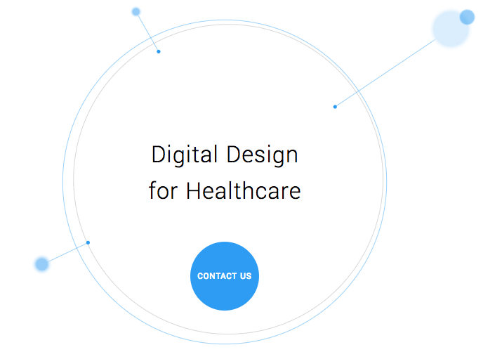
    Single page websites are very popular right now with web designers. With so many new ways to develop websites, they’ve become a unique and scroll-friendly way for users to interact with a company in a way that they’re used to (cue the token image of people scrolling through phones). And, to be fair, they can be quite beautiful. For example, take this design from 415-Agency, a San Francisco-based design firm that works with healthcare companies to make their digital products user-friendly, seamless, and as they put it, “awesomely good looking.”

    Image Of Screenshot of Digital Design for Healthcare One-Pager - Search Influence

    It’s an understatement to say that ton of work went into this site—it won them an honorable mention award from Awwwards, an organization that gives awards for the best designs, talent, and web dev agencies across the world. I’m a huge fan of exciting visual content, interactive graphics, and designs that enthrall. But, where some entrepreneurs get into trouble is when they try to manage a killer single page website while also optimizing it for SEO. They may come to discover that, for all its glitz and beauty, they’re the only ones actually finding it online.

    Photo Of Stock Of Boxes - Search Influence

    Form Must Follow Function

    Just as the customer is always the top priority, your website should follow that same line of logic. When thinking of how to design your website, think of not just how users will react to the visuals, but also how they will eventually interact with the site’s navigation. Give them clear avenues for finding more information, ordering products, or exploring your blog or testimonials. While a single-pager may seem simpler, it can often be easier to get lost and frustrated with trying to find a relevant page of content. To quote marketing guru Neil Patel, “website usefulness is more important than website beauty.”

    If a user comes to your site and thinks, “wow,” then give your web designer a bonus or yourself a pat on the back. But, the more important thing you should worry about is if their next word they is, “how?” Users should know how to interact with your site pretty easily. If they don’t know what to do or how to do it, then your site is harming you, not helping you. This can also lead to high bounce rates—users will eventually get frustrated and leave your site for one with better navigation.

    Another thing that can contribute to high bounce rates from your one-page design? Slow load times. I wrote about this in a previous blog in this series, but it’s worth mentioning here as well. Whether you’re using Flash (which, please don’t) or not, data-heavy load times due to unoptimized, large images that occupy your page’s whole screen can strangle your page load times.

    Single Page Websites Lack the Opportunity for Detail Laden Content

    Single page websites don’t have the space to allow for specific, rich content. From a user perspective, this limits the opportunity to provide a visitor with detailed, relevant content on topics they want to learn more about. Instead, they’re likely only able to view around a paragraph on specific topics. From an SEO perspective, this also gives search engines fewer opportunities to crawl your site for content that can help you move up in rankings while asserting yourself as an authority on your subject. It puts a great amount of pressure on a small amount of words. And, if you do manage to get a lot of content onto a single page, it ends up looking like it’s fighting for space.

    Image Of Post-It Notes - Search Influence

    Google likes to see that you’re updating your site with relevant content. If you have a single page site, you could make the argument that new content could be added to the bottom, creating an endless scroll of text and images. But, that method still doesn’t address the problem of not allowing search engines to crawl multiple pages of relevant content, and it also creates a headache of a user experience for visitors.

    By building out pages for your content to live, you give visitors designated, clean spaces with which they can explore your services, products, or ideas (blog posts) to their heart’s content. They don’t have to scroll for a minute or two to find your latest blog post, and search crawlers can find it easier, too.

    Forget About Performing Wide Keyword Targeting

    Since single page sites are generally designed around one main concept, the opportunity for using multiple keywords is very limited. With a multi-page site, every page has a chance to introduce a new topic or genre that can include different types of keywords that target different users and open up multiple avenues for ranking.

    With a single page site, it becomes extremely difficult to rank for varying keywords. For example, say you’re an owner of an HVAC company. You provide installations and repairs for furnaces, A/C systems, ductless A/C, water heaters, as well as air quality testing. By building separate pages for each of those services, you have an opportunity to move them each up in Google’s rankings, all while showing an increase in your authority. Putting all of your content in one page is like putting all of your keyword goals in one basket and hoping Google magically picks them up.

    Missed Opportunities for Quality Tracking

    Having multiple pages means multiple opportunities to track user behavior. You can track if someone spends 5 seconds or 5 minutes on a page about one of your services. With that valuable data, you can then focus your goals on what pages need work to bring in more visitors and convert them into customers. Obviously, this would be a difficult task for a single page site. The data showing time spent by your users will be very general, leaving you unable to tell what they love and what they dislike.

    Are There Examples of Single Page Designs That Work?

    There should and will always be design diversity on the internet. And sometimes, a single page site may work for you. For instance, take this site made by firm Gin Lane for GE that explores everything about the inside of volcanoes. Not only is the site visually satisfying, filled with video and interactive graphics, but the scroll feature of a single page makes sense because you’re literally venturing down into a volcano. Educational sites like this can have the luxury of not worrying about how SEO-friendly their content is because their main goal is to inform, not sell a product or service. Also, it doesn’t hurt that GE has the budget to build a site like this.

    Image of Screenshot of Volcanoes Single Page Website for GE - Search Influence

    Another example of a single page site working to your advantage can be when you’re utilizing it as a promotion. FBC Creative Tech Design created a site for FOX’s upcoming show, “The Gifted,” a show based on the X-men series of comics. The site, using the fictional “Sentinel Services” organization from the show, details the reasons why people should get tested for the “x-gene.” There have been numerous pre-launch sites built to create a buzz around upcoming movies or shows, and this is a fantastic way to build awareness. They’re almost like temporary landing pages. It’s worth noting again that it’s no coincidence that some of the better single-pagers are tied to large organizations—they simply have the budget to pull it off.

    Combining the Storytelling Approach of Single-Pagers Into Traditional Navigation Sites

    There’s no denying that some single page websites create curiosity. They can encourage the user to explore by simply scrolling instead of clicking, and they (ideally) tell a story about their company along the way. Businesses looking to wow users with a cool site while also being optimized for SEO should try to incorporate this same type of organic curiosity into a multiple-page, traditional navigation website. It’s completely possible. Take this blueprint of a popular WordPress design scheme from Undsgn—Uncode.
    Make each page a rewarding experience for users, where they can sit and really get comfortable with your content. If you design your multi-page site with the same goal of clean content without a lot of clutter and clear calls to action, then you’ll achieve a lot of the same aesthetic ideals of a single-pager, and with better SEO capabilities! Also, consider using visual content on your pages, like animation headers and background video. Just make sure they’re optimized so that they don’t slow down your load times.

    The ultimate decision on whether or not you choose a single page website for your business will be up to you. Every website is different; it may work for you. But, it will also be that much trickier to see your site move up in Google’s eyes and, inevitably, in rankings. If you decide that more than one page fits your business, you should learn more about SEO services which are imperative to the health of your website.

    Stay tuned for our next blog in the series, Rookie Website Mistakes, Part 5: The Content Is Weak.


    Images:

    Digital Design for Healthcare

    Volcanoes

    Blog Masonry

  • Nine Brands Who Have Mastered Instagram

    Each social media has its distinct character, but Instagram is a beast that many small businesses aren’t familiar with. Twitter is quick and to the point, Facebook friendly, and Linkedin professional. But what about Insta? We can look at these nine companies that are effectively using Instagram to uncover the secrets to its members’ hearts.

    Beautiful Images Are the Core

    Instagram is an image based platform. It’s where hobby photographers, style setters, food artists, and more come together to show off their photos. If your business wants to get noticed, you have to have images that resonate.

    Boutique-style online fashion retailer ModCloth uses magazine quality photos that feature their staff members wearing some of the pieces they carry. Some are more glam and others silly, but they are all well lit and intentionally shot.

    ModCloth Instagram screenshot

    Let Your Hashtags Run Wild

    On Twitter, it is best practice to keep your hashtags to a minimum, and most people only use them on Facebook when they’re being glib. Nothing could be further from the way hashtags are used on Instagram. It’s not uncommon to have 10-20 hashtags on a single image, covering every different way you can describe the image.

    Inspirato uses multiple variations such as #luxuryhome and #luxuryvilla to widen the scope and make it more likely someone searching will find images of their vacation homes. They also use trendy hashtags like #travelgram to make sure they are part of the greater conversation.

    Inspirato Instagram screenshot

    In addition to using hashtags to be found by potential customers, hashtags can help you find your customers. Camp Brand Goods created the hashtag #keepitwild and encouraged their followers to use it when they took photos with their products. They then “regramed” those photos, showing off the testimonial while building a relationship with their customers. Customer spotlights are a creative way to build hype and fan loyalty, and they’re easy to leverage using hashtags.

    Campbrand Goods Instagram screenshot

    Build an #Aesthetic

    The most popular Instagram feeds have a coherent theme or aesthetic that appears in each of their photos. This doesn’t mean you need to have your logo in every single photo (but if you can find a creative way to do that, then go for it!). However, having a consistent color scheme, lighting, and subject matter will help to solidify your brand identity. While the three images below from Havenly all have different subjects, the color scheme ties them all together. They all invoke the same feelings and reveal what the brand is all about—decorating spaces with a sense of calm and modern femininity.

    The Havenly Instagram screenshot

    Screenshot of The Havenly Instagram post

    TheHavenly Instagram post screenshot

    Sell a Lifestyle

    Your brand identity is who you are as a company, but the lifestyle you depict in your images is who your customers are. If you’re a car dealership, what kinds of people buy from you, and what do they value? All things USA, the outdoors, family BBQs? Then show those things in your images.

    You don’t have to limit your posts to just pictures of your products. Four Barrel Coffee shows images from the coffee-creation process, as well as the final product. They also post images that appeal to their hipster demographic, such as this photo of their new record player.

    FourBarrelCoffee Instagram screenshot

    If you want to show your products, take a page out of Sphero’s book and showcase some of the features and unique selling points of your business. Their little toy robots roll around all sorts of obstacles, and their photos and videos actually catch them in action.

    Screenshot of Sphero's Instagram post

    ‘Gram in Real Time

    In addition to sharing staged and styled photos, Instagram can be great for showing off things that are happening at the moment. Testing a new prototype? Take a short video of it in action to use as a teaser. You can also share photos from events, like Dolphin Browser did. This is especially great if you’re hosting an open house, since it can show people how much fun they’ll miss if they don’t head over right away!

    Dolphinbrowser Instagram post screenshot

    You can also share photos of your office, a day in the life, or other images of your energetic, smiling employees! It’s something we do here, as well, so you know it’s got to be a great idea 😉  Make sure you follow us on Instagram for updates.

    Search Influence Instagram post screenshot

    Get Local With It

    Small businesses often have close connections with their local community. Take advantage of that by following other local businesses, Little League teams, and other community organizations you want to foster a relationship with.

    Kawaii NOLA is a New Orleans clothing and novelty store that specializes in Japanese imports. In addition to showing pictures of their products, they often share flyers and other information for small businesses, local artists, and Japanese cultural events throughout the city.

    Kawaiinola Instagram post screenshot

    By cross-promoting other nearby businesses, you can unlock a new potential audience.

    In this example, classic anime and film fans can learn more about Kawaii NOLA, and Kawaii NOLA customers may choose to see another film at this theatre after this event is over. Everybody wins!

    Instagram is a brave, beautiful new world for businesses. At the center of all of the examples above is one simple piece of advice: be authentically you. Whoever you are as a company and brand, show that off, and you’ll find the customers you’re looking for.

    If you want help managing your social media accounts, reach out to us to see how we can help!

    Images:

    All screenshots by Meaghan McCarthy. Taken September 2017.

  • How to Write Clear CTAs That Convert

    According to Small Business Trends, “70% of most B2B websites lack a call to action.”

    With millions of websites in existence, the odds are slim that a user will visit your site and miraculously remember your URL or bookmark it for later viewing. Without a continued, personal connection through an email newsletter, a white paper download, a podcast subscription, a special offer, or another form, it may be the last time that person connects with your business online.

    A call to action, or CTA, attempts to establish that connection with your potential customers once they click on your PPC ad and head to your landing page. Even if you’ve got a CTA on your site, it may be deterring visitors rather than inviting them to explore your business. Here are some tips to make your CTA convert visitors into customers.

    Start Strong With Action Verbs

    There’s not a lot of space to get your point across, so it’s important to get straight to the point. Use an action verb to start your call to action. If you’re in the eCommerce world, consider using words like “shop” to start your CTA, possibly followed by “and save 50%.” The goal is to be direct and informative, highlighting the exact action you want your potential customer to take.

    Image of CTA Get Your Guide - Search Influence

    Focus on Value and Benefits

    As a general rule, think of how you might be able to finish your potential customer’s thoughts for their desires/pain points/expectations, and then use that action verb at the end of the following sentence: “I want to _______.” What was the first thing that came to mind that your clients might choose? Grow more leads? Find shoes that slay? Get My Custom Ad Analysis? Start My Free Software Trial? The answers to this hypothetical question are completely dependent upon your business, but one thing remains true—they need to focus on how you can delight your customer by providing them relevant solutions and unique selling points that make their life or job easier. Instead of phrases like “Buy Now,” which focus on an action a user has to do, get more creative by emphasizing what he or she will get out of clicking that CTA.

    In a case study from Unbounce, a B2B website owner reported a 38.26% increase in conversions after replacing just one action verb—Order Information vs. Get Information. With the former, “order” puts the customer in a difficult position—there’s either purchasing the service or not. But with “get,” the potential customer gets to see advantages or rewards. He or she is potentially awarded valuable, relevant information for choosing to continue the buyer’s journey. It’s this combination of value and relevance that can make or break a click.

    Another tip about delivering benefits: Don’t make claims or offers you can’t deliver on. This is going to be the start of a potential relationship with a new customer. The last thing you want to do is promise something you can’t afford.

    Image Of Girl Writing On A Blank Card At Her Desk - Search Influence

    Keep It Short and Be Specific

    According to research performed by Dan Zarrella at Hubspot, the most engaging Press Release headlines are between 90–150 characters. The same holds true for crafting landing page headlines and their corresponding CTAs. Be concise, focused, and goal-oriented. Going back to emphasizing value for the customer, consider these more focused and value-driven options.

    Generate Leads ⇒ Generate {higher quality} leads by {unique qualifier}

    Drive Sales ⇒ Drive {higher value or more} sales by {unique feature}

    Measure ROI ⇒ Measure ROI {across all channels} with our {unique product}

    Sure, the first versions were about as short as you could get, but the amended CTAs remain concise while giving a more in-depth and accurate portrayal of what the customer will get. Clear copy should help reduce any anxiety or confusion that someone may have about exploring your company. And let’s face it; people have a limited amount of time to explore your content. Make the time they spend on your site valuable, not wasted.

    Use Natural Language—Submit or Click Now? No Thanks.

    These antiquated terms used to be exciting when it really was a novel concept to be able to click on something and get immediate results. After all, most CTAs before the internet involved a number that you had to call. Now, though, that novelty isn’t the selling point; what you can provide your customer is. When thinking about writing your CTA, think about how you can connect with them. One way to use this in your writing is to use the words “you” and “my/our.” For example, “Drew Brees Can’t Stop Talking About Our Training Program. Learn Why and Get Fit.”

    Steer clear of using ornate language by cutting unnecessary adverbs and adjectives. These words may seem like they add value to your copy, but they’re hiding the value that you can provide your customer.

    Also, avoid using industry jargon in your copy. This can include words like, “franchise,” “utilize,” “virtualization,” “capitalize,” and especially acronyms that only a limited number of potential customers would even understand, like these marketing big ones: KPI, RSS, CAC, CSS, CRM. Doesn’t look too inviting does it?

    Does the Size and Layout of the CTA Matter On a Landing Page?

    Just like your copy, your page layout should be neat and clean. Kissmetrics recommends: “The size of your CTA buttons is also important. A too-small version won’t command attention, while a supersized one will make you seem desperate.”

    Think about how your landing pages look from a visual standpoint. Avoid the color red for your CTA. There are too many associations with danger, stop signs, stoplights, aggression, etc. You’ll likely see more positive results from calm colors like blue or green.

    Also, consider the size and spacing of your text on the page. It should be scannable so that a visitor can instantly pick out the information they’re interested in. Cut out the clutter. For instance, here’s an example from Macy’s current main landing page. Aside from the mixed messaging of the different values, can you spot the call to action?

    Image Of Macy's Landing Page Sale - Search Influence

    Their “star rewards” offer is shifted to the right of the page. The goal for a button’s CTA is to predict where the user will look next. This one missed that mark. Also, it’s hard to tell what “JOIN NOW” means until you read the tiny print at the top indicating this CTA is for their rewards program. And finally, they’re asking a lot of their visitors to read the fine print on all of these different offers. A cleaner example of a landing page with less clutter and more clarity would be like this one from Teambit, an employee feedback, recognition, and survey startup.

    Image of Teambit Landing Page - Search Influence

    The value? Your team could be the best it can be. Sounds great. How do I go about doing that? Oh, I’ll get started for free. They have detailed information if you scroll through their page about just how they help people. But the reason why it succeeds is because it doesn’t worry about that up front. It focuses on the why with a compelling headline followed by clean copy and a simple CTA. Sometimes, it really is that simple.

    A Few Final Ideas for Crafting Great CTAs

    In addition to the previously mentioned points, here are a few examples of how you can make your CTAs stand out and drive conversions.

    1. Make sure to always display the benefits. If you’re offering a free guide, then say so right away (e.g. “Get the Knowledge You Crave – Download Our Free Guide.”).
    2. Try using a pain point that your potential customers may be hitting. For example, “Tired of Not Seeing Results In Your Ad Campaign? Watch Our Free Webinar to Find Out…”
    3. Also, you can try using an Influencer who supports and promotes your brand. This adds authority and intrigue to your CTA. Viewers who see that “Mark Zuckerberg Is Crazy About Our Team’s Marketing Ideas” will likely want to click on the corresponding, “Discover Why” button.
    4. Lastly, utilize testimonials from your current clients. This is a source that people often overlook. Your customers should be the biggest proponents of your brand. If a client has said that you’re the best company they’ve ever worked with, then take that and condense into copy to go along with a short, action-oriented CTA. Of course, always make sure to attribute ownership of the testimonial, and it goes without saying that creating a fake testimonial is a horrible idea for your brand. You’ve got to earn them.
    5. Numbers are great. If you have some success metrics, consider including them on your landing page. Are 100% of your employees certified in the service you’re promoting? Visitors should know that.

    Have any great examples of CTAs in landing pages or other types of content that you’ve seen? Share them with us! A great CTA can have your business seeing more conversions and fewer bounces. Need some more guidance on building a landing page that has strong calls to action that focus on your company’s brand and values? Reach out to us at any time.


    Images:

    Macy’s

    Teambit

  • Security! This Site Isn’t Safe! What Will Google Do About It?

    Business is booming, leads are pouring in from your homepage form, and it seems that the direction of your company couldn’t be brighter. Then your leads seem to stop in the tracks and business slows down considerably. What could’ve happened? Your landing pages and main site call to action are perfect for getting users to fill in forms. Then, as you peruse your site, you notice something new, and now one of your greatest assets is your greatest foe.

    Google and The Internet

    I’m sure everyone here is familiar with the fact that Google got its start as a search engine and is now the most popular. After conquering the way people search, Google decided that it was time to innovate how people browse the internet itself. In September of 2008, Google Chrome was released in its beta format. This new web browser boasted being integrated with Google technologies and quickly put a foothold into the internet browser market. Now that Google controls a majority of the internet browser market share, their next big move is about to launch—security.

    Internet and Privacy

    The internet has come a long way since my childhood days of signing into AIM over a 14.4K dial-up modem. Now, I play League of Legends (yes I am using them as my example) with my gaming rig linked directly to my cable modem with a T1 cable that provides download speeds of at least 150mbps. With this rapid transfer of information constantly happening, one has to worry about the downsides, right? Right? Most of us don’t think about the downsides, but Google has thought of this for us. Back in January of this year, Google released its first major security update from the scope of usability.

    Image Screenshot of Google's first security update - Search Influence

    Previously, a lowercase “i” was displayed in the address bar and could be clicked to display more information about the particular web page including the security of your connection, how many cookies the page uses, and a plethora of other tidbits of information. Now, whenever you enter a password or a credit card number on a site that isn’t secure, a handy message pops up to indicate that your connection to the website is not secure.

    So What Exactly Is a “Secure” Site?

    A website that doesn’t have an SSL Certificate installed transmits all data as plain text. Meaning, if I type my name “Jared” or my email address, or even “281-330-8004” into a field on an http website and send it to the server, it will be sent and saved on the server as plain text. What this means is that any vulnerability that is exploited in one of these sites would hold a nice, tasty database of personal information for would-be attackers to exploit. Sites with https servers work a bit differently. Your computer and the secure site initiate what is commonly referred to as the “SSL Handshake” to confirm that it is trustworthy. The https sends its SSL Certificate over to prove that it is a source that can be trusted. Any information shared over this connection is encrypted, which means that even if an attacker is able to procure a database of information that doesn’t belong to him, it will be encrypted and unable to be read.

    And This Has to Do With Google How?

    At Search Influence, it is our duty to know Google as well as we know ourselves. Through various means, we keep tabs on Google and exactly what this robot and its creators are really up to. In our findings, we’ve discovered that Google is about to shake up the internet. On October 1st, Google Chrome will receive a security update that will change how it displays sites that are not secure.

    Screenshot image of Google's past, present, and future "not secure" notifications - Search Influence

    The graphic above displays past, present, and future versions of Chrome. As you can see, the “not secure” notification in the address bar will not only display on password and credit card form fills, but on **ANY** form fill. Google is using its bots to track down any <input type=”x”> elements on your page and flagging them according to the notice that webmasters received in Google Search Console.

    That Doesn’t Seem THAT Bad

    If you feel this way, I’m personally inclined to agree with you. Most of my online purchases and passwords are already behind secure sites like Amazon and the like. If some hacker gets my email or my alternate email, why would I care? Well, if you think like me, there will be an eventual rude awakening. Google has already announced that it plans on marking all non-secure sites with a nasty red triangle and red text reading “not secure” in the address bar (see below).

    Screenshot of Google's "not secure" warning - Search Influence

    That tiny addition to the address bar may not cause a slowdown in form submissions on October 1st, but in the future, when that beautiful red triangle and glorious red text appear next to your web address, I’m sure people will think twice before submitting their personal information to your website. There’s no need to panic about this quite yet; Google hasn’t announced an official time of release for that update and, luckily, they’ve given us ample time to comply.

    Will This Slow My Site Down?

    Barely. Previously, this was an issue with https websites sometimes taking a half a second longer to load, but in this day and age, technological advances have reduced this slowdown time to a few milliseconds. If you do migrate your site to a secure server and notice significant slowdowns, it more than likely means that your site isn’t optimized for a secure server. Cloudflare has an in-depth article about bolstering your site’s configurations to improve speed after migration. The benefit of a visual that proves your site is secure is definitely worth the cost of a negligible increase in load time.

    In addition to migrating your website to a secure server, some auxiliary tasks must be completed to ensure your search rankings aren’t affected. Here at Search Influence, we know that your business is very important to you. Contact us for help ensuring your website is safe and secure for your visitors.

    If you want some more information about Google’s push for secure sites, check out the talk below by Emily Schechter, Google’s own Security Project Manager.

  • SI Is Ending Summer With a BANG — Welcome Our New Influencers!

    SI Is Ending Summer With a BANG — Welcome Our New Influencers!

    This month, Search Influence welcomed a lot of new faces to the office! Meet the newest members of our team.

    `

    Jenna Mire – Account Coordinator

    Jenna recently moved to New Orleans from Atlanta, GA after the horrific fall of the Falcons in the 2017 Super Bowl. Jenna graduated from Centre College where she received degrees in Behavioral Sociology and Anthropology while playing basketball. She is also the winner of the 2007 Hot Dog Eating Contest, women’s division, sponsored by Energizer Batteries. Jenna enjoys playing Sudoku, parallel parking, and eating Cheetos Puffs.

    Katie Burke – Accounting & Administrative Assistant

    Katie grew up in Liberty, New York and moved to New Orleans to attend Tulane University. She recently graduated from Tulane with her Master’s degree in Accounting. When she has free time, she loves to bake and sometimes sell specialty cakes for weddings, birthdays, and special events.

    Ceallaigh Montgomery – Sales Executive

    Originally from the North Dallas area, Ceallaigh (pronounced Kay-Lee) graduated from LSU with a bachelor’s degree in Marketing. Before joining the team at Search Influence, she worked as a Benefits Consultant with Aflac for a year where she really got a taste for Business-to-Business selling. While in school, she was in the LSU Tiger Band. So, it’s safe to say she is an avid LSU football fan. In her spare time, she loves cooking up good food and tailgating.

    Rhonda Ladner – Sales Manager

    Rhonda has spent the majority of her career in some form of sales & sales management. She grew up in technology sales at BellSouth and then AT&T, and over the years she has owned two different sales-related businesses: Sandbox Solutions (focused on sales training) and Ladner Consulting (focused on sales/process consulting).  She is a proud born-and-raised New Orleanian with a husband and two sons. In her free time, she loves cooking, traveling, and spending time with family & friends.

    To Jenna, Katie, Ceallaigh, and Rhonda—welcome to Search Influence! We’re excited to see all of the great things you’ll do here.