Tag: website

  • Watch the Possibilities Unfold

    For many years we’ve considered the fold, or the first 600 pixels of content on a website, to be the gateway for user interaction and hopefully the production of leads. To take advantage of this, we’ve filled this space with as many buttons, forms, and click-through opportunities as humanly possible. The result, oftentimes, was a cluttered site with so many calls to action that viewers didn’t know where to look first.

    So what’s changed?

    Tablets and smartphones have helped us by naturally encouraging users to scroll. These smart devices have not only made it easier to scroll, they’ve also made it fun! Because of this, the purpose of those 600 pixels has changed. Instead of using the space above the fold as the one and only location for possible lead generation, we can use this area to help direct the viewers’ eye down the page to discover more.

    How do we do that?

    Have you ever seen a social media contest that directs you to “like” the page and enter to win? The designs for these ads usually include a directional arrow that points up to the “like” button, to help you understand exactly where you need to go next. Often times the call to action for this type of contest will be sometime similar to ”Like & Enter” or “Like us to find out more.” The need for a clear call to action on websites such as the ones used for contests is now more important than ever.

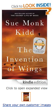
    An even better example of a great call to action is Amazon’s graphic to get customers to take a look inside of one of their books.

    Screen Shot 2014-01-22 at 3.56.49 PM

    What is it about Amazon’s call to action that makes you want to click on that book? How can you achieve a similar effect? Here are three tips for creating a successful call to action:

    1. Use a Contrasting Color

    According to The Institute for Color Research, we subconsciously make judgments about people, products and their environment within 90 seconds of seeing them. Between 62% and 90% of that initial judgment is based solely on color.

    The most important thing to consider when selecting your call to action color is to choose one that will stand out on the page. If most of your page has varying shades of blue, a bright green button will do the trick, or a golden shade of orange. As KISSmetrics highlights in their infographic on color, this can be achieved by using analogous colors for the background of the page’s main content, while using a complementary color as your call to action color.

    Take a look at the Amazon example again. Did the contrast of the blue and the orange catch your attention?

    2. Remember these 3 C’s: Clear, Compelling, and Concise

    “Read the Case Study”
    “Try it For Free”
    “Take a Tour”

    All three calls to actions are common, but effective. They tell the user what they will be doing: reading, trying, and touring. By eliminating the concerns of the user, you compel them to want to find out more. Case studies, free trials, and tours are great ways for the user to find out more information. If you can do compel the readers clearly and be concise in your wording, you will have successfully created a perfect call to action.

    Amazon’s example achieves this in two ways. The call to action, “Click to Look Inside” is to the point, but they’re actually able to abbreviate this even more by emphasizing “LOOK INSIDE.”

    3. Give Directional Cues

    Whether you’re attempting to get your customer to scroll down the page or trying to direct them to your form, you need to use directional cues to show them where they need to go next. From arrows that point to the call to action, to imagery that implies the need to scroll down to see more, people subconsciously want to be prompted towards their next step.

    The arrow for Amazon’s click to look inside serves two purposes. It implies the action of opening a book while also directing customers to click on the image of the book to see what’s inside.

    Another great example of directional cues is on the Nike Better World site. While there is not an arrow or obvious directional cue, customers will subconsciously want to scroll through the page because of the visual implication of movement. They use a very subtle, but effective approach for directing their customers to look further to see more.

    Michael Lykke Aagaard, a A/B testing guru, blogged about testing he did on the positioning of a CTA. He states that this test showed a 304% increase in conversions for the placement of the CTA under the fold. If that isn’t proof enough, try it for yourself and watch the possibilities unfold.


  • Welcome to “Can’t Code”

    Lessons, Musings, and Complaints about Digital Technology

    I started working at Search Influence a few months ago. Before that, I had a lot of web design experience, but all of it was very informal and self-taught. Due to budget cuts at the University of New Orleans, my graduate department asked me to volunteer as their “web guy” when they were unable to afford a real administrator. This meant that I had to do some very quick, ad-hoc studying in order to fulfill this role. Up to that point, I’d learned a lot about the most basic architectural features of the internet, like HTML and CSS, but it took a lot of research before I could make sense of the web’s more sophisticated components. At the time, PHP, Javascript, the infamous WordPress “Loop,” and other institutions of cyberspace appeared to me like confusing, mystical clouds of information.

    Image of Indonesian Students Using a Laptop

    I felt simultaneously intimidated by these topics and ashamed to inquire about them because I felt I should already know the answers. Finally, out of necessity, I set aside my ego and asked my more well-informed peers to share their skills with me, a request that was, of course, met with enthusiasm. The process of learning these skills was still challenging, but being open and honest about my ignorance was my shortest path to success (think I saw that on a poster somewhere).

    That experience made me reflect on the “digital divide.” Even as someone who was raised on computers, I struggled to understand how people operated behind the point-and-click Windows interface that I grew up on. I could only imagine how difficult this same endeavor would be for, say, my grandparents, or my childhood friends whose families were too poor to have a Nintendo, much less a laptop. Even though digital technology has permeated some of the hardest-reached socioeconomic crevices of our society, the standards of what constitutes “literacy” in a rapidly evolving economy is a moving mark. While many people are becoming comfortable with the Graphical User Interfaces (GUIs) created to help them interact with digital information, knowing a little code helps to fully participate in and understand the digital spaces of our lives.

    What Now?

    Image of binary data

    Beginning with this post, I’d like to share what I’m learning as a Junior Web Developer at Search Influence, in the hopes that others with a low to moderate level of computer literacy may learn something. Future posts will appear monthly on the Search Influence blog and cover various facets of the digital technologies that I use to complete my daily tasks. Some posts will describe what these technologies are used for, some will provide a tutorial on how to use them yourself, and others may simply give commentary on the history and social implications of these technologies.

    Next month, I plan on covering the very basics: ones and zeros. We commonly see long strings of 1’s and 0’s in the popular media that are meant to represent some form of digital information. But where does this code come from, and why is it used?

    Chart-border

    Stay tuned for the answers next month! And for any code questions you want answered, comment below.

  • 3 Ways To Make Your Website More Skim-able

    Bill Gates once said, “If your business is not on the Internet, then your business will be out of business.” I think we can expand on this and say that if your business doesn’t use the Internet to its advantage, it will not compete with those that do. This includes things like good SEO and a smart social media strategy, among other marketing tactics. Since all of these things are aimed at directing people to your website with the goal of converting a user into a customer, that site better be up to the task.

    There’s some bad news, though: most people don’t really want to read your website. They don’t have the time or the interest. But fret not! Your web copy can still be effective if you write it with this in mind. The key here is that you allow your readers to get the info they need quickly and without much effort. Let them skim!

    Mobile Search Content

    1. Visually Appealing Content

    Your copy should never look intimidating. Large chunks of text are out. Small paragraphs labeled with subheadings are the way to go. Bulleted or numbered lists are even better. Remember, a lot of your readers are likely using mobile devices. It doesn’t take much text to fill the screen of a phone, which might turn off someone  looking for a specific answer.

    2. Give Them What They Want

    Think about why someone would visit your site. What info are they looking for? That info should be the star of the site. If you own a tire shop, people are probably visiting your site for a few details: location, hours, services, products. If you own a dental practice, they’ll want to know what types of insurance you take, what services you offer, and your location. You can have more than the basics on your site, but make sure that you at least cover the most important details in a way that is easy to read.

    3. Put It Where It Belongs

    Make sure that your site is easy to navigate and all pages are clearly labeled with a logical title. “What We Do” is ok, but “Services” is better. Don’t put your hours on the “About Us” page. Put them on a page labeled “Hours of Operation.” You want your readers to scan the homepage and be able to quickly find the information they want or quickly figure out how to navigate to that information.

  • The Return… of the Website

    Website examples

    The website is back, y’all!  Yeah yeah, we know they didn’t go anywhere, but for the last few years we have had a large shift to companies investing in their social media presence and building out experiences that their fans can interact with on Facebook.

    It made sense 100% of the way at that point in time. That’s where the users were — on Facebook. That’s where MANY users still are. Facebook is still growing; albeit, not quite as rapidly as 2 years ago, but doesn’t it feel like you see at least one new aunt and uncle popping up on Facebook each week?

    If it’s growing, then why does it feel like it has become stale?

    The challenge here lies in the evolution of Facebook over the more recent years. Facebook started with a wall for each person. That was the only place, besides on your own profile, that you could write anything on Facebook.

    If you wanted to see what someone was saying, you had to visit individual Facebook profiles. Since 2006–and then expanded upon by “the new Facebook” in 2010–we have the News Feed. Facebook prioritizes what it thinks is news based on an algorithm of what it thinks you want to see. The problem is, I am pretty bored with checking my Facebook because the algorithm hasn’t quite got it right, and it’s too far gone to ever get corrected.

    If you are a business, Facebook admits only 16% of your fans (I refuse to call them “like-ers”), are seeing your posts that you are putting all of that thought and energy into. Now I am not recommending you abandon Facebook — as you shouldn’t — buyers (especially women) are on Facebook, so learn how to improve your EdgeRank with our recent post by Laura Manning.

    When Facebook users see only a couple new posts every time they check, they get bored. And bored on Facebook means your user starts to think “hmm… what else can I do on my mac, iPhone, or iPad?

    I have found that I have started to wander the internet much more than I did a year ago. Facebook used to consume about 90% of my leisure internet use. Now it consumes about 20%.

    Website Under Construction

    What I am starting to find is an appreciation for websites again: a place where you can go and dive deeper into a product or service and really discover your options. Kind of how it was in 2000.

    So for those of you who have truly been investing in your websites in the right ways over the past decade, who have recently started, or  want to make an investment now, my prediction is that is the right time to do so.

    The Key Things You Need to Remember:

    1. Make sure they can picture themselves using your product.

    Got a spa? Make sure they can see themselves in it. Got a house cleaning business? Make sure they can picture themselves sitting in their clean living room when you are done.

    2. Sell it.

    Sell what you’ve got to offer. Whether you’ve got, again, a spa or a house cleaning service, buyers want to read all the juicy details of how they’re getting a quality, comprehensive service for their hard earned cash. Explain every aspect of your packages, down to the last detail. Even if you think it’s insignificant, your buyers will appreciate it. Your customers want to know the benefits!!

    3. Update your website. 

    Feature all of your products or services on your website. I want to know what you can do for me. No one wants to ask “do you do stump grinding?”

    4. “Give away a little bit of the store.”

    Search Influence’s Director of R&D, Amy Arnold, often preaches that each website needs to “give away a little bit of the store.” This means provide info on your site that you would typically share with someone when you have an initial call, consultation, or meeting with them. Yes, yes, it may be more than you want to put out because “what if they don’t call me” but trust me, this is the right thing to do. We have low bounce rates on sites that support this recommendation.

    If you provide them the information they are looking for without them having to call you, you are proving to them that you have the knowledge — when you competitors are probably not.

    The key learning here is simple — don’t ignore your website — your website should be updated almost as many times as your aunt comments on your recent pics on “the Fbook.” Your customers are searching, and they will likely find you if you continue to keep your website up to date. Of course, doing some off-site promotion of your site never hurt either, but that’s not the point of this post 🙂

    Your website is being looked at more than you think. And if you don’t know how many visits you are getting to your site and from where they are coming, for heaven’s sake, install Google Analytics on it!

  • Website Mobilization Tools Go Head To Head: DudaMobile vs MobeeArt

    I don’t know about you, but I can barely leave my desk without grabbing my iPhone and bringing it with me. I know I’m not alone in this because as of May, more than half of U.S. mobile users have smartphones. Each day more people are interacting with websites, search results and advertisement via some type of mobile format. That is why it has become increasingly more important for businesses to make their websites mobile-friendly.

    There are several companies offering services to mobilize your website quickly and easily. Two services that have caught my eye are MobeeArt and Dudamobile. Dudamobile has partnered up with Google to try to create a more mobile-ready internet, while MobeeArt boasts an intuitive “what you see is what you get” approach. Both claim to be the easy DIY place to mobilize your website as quickly as possible.

    WYSIWYG Editor

    MobeeArt offers a mobilization suite that is both feature-rich and claims to have an ease of use and intuitive navigation. The company offers two versions of their suite: a very simple editor that instantly mobilizes your website and a much more robust suite that I preferred.

    MobeeArt Self The basic editor seems to be pretty par for the course as mobilization suites go. The view screen is cleverly phone shaped with basic options on the left hand side. The advanced editor, however, is a robust and visually comprehensive editor. The advanced editor allows you pull different items (photos, logos, text) from the desktop version to add to a custom-made page on the mobile site and tokenizes them to automatically sync with any changes that happen to the desktop site.

    Dudamobile’s suite has a much more subtle difference between their basic and advanced editors. The visual representation remains “phone on the right; features on the left” regardless of whether you look at the basic or advanced editor. This caused certain difficulties later on in the process of mobilization.

    Navigation

    MobeeArt
    During my testing, I found that while I enjoyed the robust feature set of the suite, I was very put off by the difficulty to find some of those features. Figuring out how to add the call tracking feature I wanted or where certain features lived inside the suite’s architecture proved to be quite the undertaking at times.

    MobeeArt Studio

    Navigating the website’s architecture, however, was incredibly easy in the Studio. The site’s skeleton was prominently displayed on the left hand side next to a visual representation of the website. The basic sitemap and relationships between parent and child pages are easily accessible.

    Dudamobile
    DudaMobile Full Dudamobile’s feature set is much more easily navigable than MobeeArt’s. Each feature has a small chiclet and menu label so finding that HTML box option isn’t a task unto itself.

    Navigating through the pages of website, however, was incredibly difficult. I had to rely on either the navigation menus built into the site I was mobilizing or a small drop down menu that listed every single page that existed on the desktop version, regardless of whether I chose to use it in the mobile version. This made switching from one page to another somewhat of a chore.

    Save Your Work!

    MobeeArt
    The advanced editor prominently displayed a save button so you would not lose your work. The basic editor seems to auto-save at a rate that is unknown to me, but didn’t make me worry about losing my work.

    The suite, however, did crash on me multiple times while attempting to edit the website and I lost a lot of changes. Remember, kids: ALWAYS SAVE YOUR WORK!

    Dudamobile
    I can only assume this suite auto-saved a certain amount of my changes, but the save button was buried as a final step to creating your mobile website. This made me incredibly uncomfortable to leave the mobilization process to do anything. Getting nit-picky about the way your mobile website looks AND not being able to take a bathroom break makes for a pretty ornery user.


    Optimization Features

    MobeeArt
    The editor had some integration with Google Analytics (very basic) and some of its own analytics, but I was pretty unimpressed by the offerings. Call tracking was nearly impossible and it was a task to put my own forms on the website. Additionally, as far as I could tell the suite did not provide canonical links.

    Dudamobile
    Dudamobile, on the other hand, automatically created canonical links to unique content. Since the company is partnered up with Google, all of the integration with Google Analytics, Webmaster Tools, and other SEO is fairly robust (albeit proprietary).

    Final Thoughts

    We are riding on the crest of the mobile wave and it is increasingly more important for us to recognize this. I don’t think the magic easy-to-use and SEO-conscious mobilization suite really exists yet. I had a lot of hair-pulling moments with both MobeeArt and DudaMobile that leave me wanting more from both suites.

    While DudaMobile probably wins this head-to-head by skin of its SEO-conscious teeth, the MobeeArt studio definitely has a slight aesthetic edge over the cumbersome one our winner provides. For best results, go with Google and DudaMobile, but watch this space for future developments in website mobilization.

  • Internet Form Response Times — Does A Quick Reply Really Matter?

    In the search engine marketing world, one of the main tools for generating leads is the use of an online form. Forms can be an invaluable tool for generating leads and increasing revenue. They also provide a metric for classifying return on investment. We are all familiar with the usage of forms, but are we ignoring their full potential by underutilizing leads? As a business management major and online marketing enthusiast, I couldn’t help but wonder how these leads are handled by the staff at the many business for which we work, so I did some research.

    I found a number of great sources on how the timeliness of a response affects the outcome of the lead. One study on lead responses went a little further then the rest. The level of detail in the study is fantastic, but I don’t want it to distract from the most important figures.

    The study was conducted by the team at LeadResponseManagement.org with a sample size of over fifteen thousand leads over a three year span. The purpose of the study was to find out how the time of day, day of the week, and the time to respond to a online lead affected the rate of contact. While the conversion rates were not discussed, we can project standard conversion rates on to the study to get a basic idea of its overall impact.

    Lets get to the meat of the study.

    • The best day of the week to contact a lead is a Thursday, best by 50% compared to the worst day.
    • The best time to contact a lead is between 4-5pm, best by 109% when compared to the worst time.
    • 69% of leads that were contacted initially within the first hour became qualified. (In the study, qualified had a few meanings including setting an appointment.)

    Okay, we all get it. The time when we contact the lead matters. Let’s dive deeper.

    • The odds of contacting a lead decreased by over 10 times in the first hour.
    • The odds of qualifying a lead decreased by over 6 times in the first hour.

    These statistics may seem a bit extreme. Just think for a second about your personal behavior. After submitting a form, there is a reasonable expectation that someone will be in touch with you soon — but how soon? Are you going to wait around all day to be contacted, or are you going to continue your search? Personally, I continue my search until I find someone that will sell me the product or service that I am looking for at the price I’m willing to pay.

    Now for the most important piece of data in the entire survey.

    • The odds of qualifying a lead in 5 minutes versus 30 minutes drops by 21 times.
    • The odds of qualifying a lead in 5 minutes versus 10 minutes drops by 4 times.

    Think about the logic behind why a quick response rate is so important. If you can manage to respond within 5 minutes, the potential customer is most likely still interacting with your website or brand. You are still at the top of their mind. With all of the psychological benefits of quick contact, the ability to get back to a potential customer before they move on to another business is invaluable.

    The bottom line is responding to online leads within five minutes results in a 900% increase in contact rates!

    While this kind of dedicated effort may not be possible for all businesses, the numbers seem to suggest it’s worth the effort. You could work 900% harder or just respond a bit faster — which do you prefer?

    Do you use forms on your business’s website? What kind of response times do you usually stick to?

  • New Kid on the Social Media Block – How to Generate Brand Awareness and Valuable Links using Pinterest

    As an admittedly addicted Pinterest user, I’d like to clear up a few things about the relatively young social media site and its potential use for marketing and SEO linkbuilding.Definition of Pinterest With Pinterest quickly rising in popularity, I’m constantly hearing it referred to as a social bookmarking tool for sharing images.  Pinterest is in fact a social bookmarking tool, but it is not only about the images. The site allows users to “pin” or save links to external sites in an organized way, with few limits to what type of site or image can be pinned.  Users can save anything from a favorite blog post to products they love, from recipes to tutorials. Each and every pin not only pulls in an image, but also a do-follow link back to the source site! Can you smell the SEO potential yet? The brilliance of Pinterest is that it combines some of the most compelling features of social media in general: visually stimulating content and the opportunity to share your ideas, interests and inspiration. Upon signing up, users are provided with fully customizable “pin boards” and can easily find friends to follow using the Facebook and Twitter connected features.
    I escape to Pinterest to avoid all the drama and bad grammar on Facebook.
    As a marketing tool, Pinterest has great potential for small retail businesses that may have a hard time competing in search results. For example, a local boutique clothing store may find it incredibly difficult to outrank Macy’s and Saks in the SERPs for a keyword like “New Orleans shopping.” When users find something they like (usually pinned by someone they follow and are influenced by), chances are they will, at the very least, click the source link. Everyday I’m introduced to new brands and products on Pinterest, and more than once I’ve used what my friends are pinning as inspiration for making purchases. There are currently few brands using Pinterest, but with its popularity and the site’s high (and still growing) domain authority, all signs are pointing to increased use by brands and businesses in the near future.

    A few tips for putting Pinterest to work for your brand:Pin It Button

    • Add the “Pin It” button to your product pages or blog posts. It’s easy to do and you can add the button along with your other social media sharing buttons.
    • Create a Pinterest account for the brand itself and reach out to “visual influencers” on Pinterest for help getting your images re-pinned. Pinterest allows any user to follow any other user without requiring a follow-back. You may also tag other users in your pins, comment on pins and re-pin (the Pinterest version of a retweet) others’ content.
    • Create boards beyond your own products and brand, but relevant to your location and industry.
    • Utilize the description fields when creating Pins by adding keywords and geo-modifiers. Not only is this SEO 101, but Pinterest addicts often use the search feature to find relevant pins.
    • Keep pinning!  The search results and Pin feeds change up-to-the-minute, much like the Twitter feed and Facebook Ticker. Maintain a steady flow of Pins to ensure your products are staying top-of-mind.

    For SEO linkbuilding purposes, the benefits of Pinterest are pretty self-evident. Some basic info on Pinterest links:

    • Each and every Pin links back to the original source site or the file location (depending on where it was originally pinned from). Unless you’re purposely optimizing for image seach, a product page or site link is probably better.

      Pin Link Locations
      Standard pins provide links to the source site in two locations.
    • A Pin provides do-follow links in multiple places. The image itself acts as a link in addition to the “From:” link in the top right-hand-corner.
    • A pin comes with embed code for syndication to other sites like Facebook and Twitter, helping to develop backlinks to the Pin itself.
    • Pins are editable! You can edit your own Pins with updated URLs or reach out to Pinners who may have pinned your images from an unfavorable source site. Pins are easy to edit and the new URL you provide does not need to host the image, though I don’t recommend you use a link without the original image.
    • Because of the visual nature of Pinterest, it is a great way to promote infographics. Make sure they are Pinned to appropriate boards and contain relevant descriptions to ensure they are shared.
    • You can even add a Pin It button to your company’s blog pages by using the WordPress plug-in.

    Thanks to the intuitive nature of Pinterest’s interface, I think the best way to get going is to request an invite and just dive in. Remember, sign-up is currently via invitation-only, so ask a friend to invite you or request one from the site (it doesn’t take long). Let me know what you think about these tips in the comments, and if my screenshots piqued your interest, follow me on Pinterest!

  • Blinded By The Site: Making Friends With Web Design Minimalism

    If you’re anything like me, when you visit a website that’s overloaded with Flash, an abundance of images, excessive menus, and just a general maze of content, your brain shrivels up to the size of a raisin and your eyes glaze over with no focus of what to look at or where to find it. (As far as I’m concerned, the same problem exists for social media outlets like Facebook and Twitter. Creating endless posts and tweets just for the sake of having more content and saying whatever pops into your fingers is the quickest way to get me to block or un-follow your posts. Then I’ll never hear anything you have to say!) The idea that the more there is to look at, the more visitors, friends, likes, and followers you’ll get is simply untrue in many cases.  You can still catch plenty of flies with sweet, sweet simplicity.

    Too many web designers and developers make choices that, while skillfully executed with complicated Ajax and fancy Flash elements, not only confuse and deflect site visitors, but also have the same effect on search engine crawlers. While when properly used (read: in moderation) these elements have the potential to add functionality and style to your site, it is often beneficial to limit or altogether avoid these in favor of a clean, easily searchable and indexed site.

    Take splash pages, for instance. When a splash page is your homepage, it not only prolongs the amount of time it takes for your visitors to get to the actual content they’re seeking, but it also confuses search engines. Without your homepage containing index-able elements like links to the other pages of your site and keywords, search engine spiders will not be able to properly crawl and index your site. Get rid of that splash page!

    Aside from splash pages, using Flash elements or images elsewhere on your site for headers and menus can often cause visual frustration and complication for visitors and search engines alike. Dancing baby Flash headers and image-heavy menus can be a dizzying headache, and crawlers simply can’t read text embedded in Flash and images. There are several great resources for web designers on how to keep your site design from being overly complex while maintaining SEO excellence. Make sure you mind your H1’s, et al.

    minimalist web design

    Personally, I agree with the late Steve Jobs when it comes to valuing the beauty of a highly-functional, simple design. There’s something to be said for keeping a clean, easily navigable, minimal aesthetic. And I’m not alone in my love of minimalism in web design.  I’m not suggesting you go out and replace all your shirts with black turtlenecks, but I am suggesting that you consider what William of Ockham said and not unnecessarily complicate matters when you can simply state your case. When you embrace minimalism, everybody wins: you, me, and the spiders. And you don’t want to upset the spiders. Trust me.

  • Website Promotion – 7 Common Lies & Misconceptions

    After many conversations with existing and potential clients, I have come to find there are many misconceptions and straight-up lies about our industry. Some of these lies are just bogus and everyone should be aware, so I’ve whipped up this handy guide with explanations!

    7. You cannot make money with social media

    This is simply a lie. Social media can be a great source of revenue. The biggest complaint about social media I often hear is, “I cannot measure the success of social media.” With the use of iFrames and reporting tools, success can now be more easily measured. An iFrame allows us the ability to create a welcome tab on your page that acts like a website, so we can install analytics, implement a form and utilize call tracking to get a detailed and effective overview of what’s going on.

    Social media is the only outlet that allows you to target your proper demographic. Through the use of highly targeted Facebook display ads, we have the ability to put your brand in front of your target audience.  Social media is also one of the easiest and most effective ways to create interaction with your existing and potential customers.  There is no reason you cannot see profits through social media.

    6. SEO is a set-it-and-forget business

    I wish obtaining the best rankings was as easy as that.  I often hear potential clients ask me “Why am I paying for a monthly service?” to which I respond, “Your competition isn’t asleep.”  Much of the work for optimizing a site is done off-site. This comes a shock to many people who believe you can just make a few edits on your site and magically you are now in position 1.

    Yes, having your site speak properly to the keywords that potential customers are searching is very important, but it is not everything. This will not get you to the top position in a competitive industry. Ongoing link building is a key element to the success of any SEO campaign. Google looks at links as a form of “popularity contest” that proves to Google you really do what your site says.

    5. I need a new site before I do any SEO

    We can help almost any site rank, including ones that are not as attractive as others. There are a few exceptions to this rule, such as Flash and templates that do not give you access to the backend management. Many time people believe that their site needs to be “pretty” to rank well, when in reality, it is more about the conversion optimization of your site. This includes prominent display of your phone number and a small form located on every page of your site. Your design has no effect on the organic rankings.

    4. Guaranteed rankings

    Since my email also attached to [email protected], I have the privilege of receiving all of the spammy SEO emails we get on a daily basis. My favorites are the ones that use scare tactics and money back guarantees. These guys are full of it! I recently read one that was trying to make you believe the paid results were part of SEO. Ultimately, the money back gaurantee is just a ploy to get you in the door, give them some money, and sure enough a few months down the road you’ll be calling me cursing everything SEO.  These scammy SEO companies can offer these guarantees by choosing keywords that are so irrelevant there is no search-around and by paying to be on page one.

    Why we not guarantee results? Hint: it isn’t lack of confidence! We would have never been able to earn placement in the INC. 500 (with no sales team!) if we did not produce results. Unfortunately we do not have control of Google; if we did, I would be on a beach enjoying a Mojito right about now. Earlier this month Google made a change to the display of search results.

    3. Article marketing does not work

    I have recently read a number of blog post questioning the effects of using articles as an effective form of obtaining backlinks. For those of you who question the effectiveness, ask any of our clients who are in the top positions for their most popular searches. We have been and continue to use articles as an effective way to obtain backlinks. What doesn’t work is spammy, zero-effort articles with poor-quality or even plagiarized content. We put a great deal of effort into this part of our services and it shows. Article marketing works!

    2. Paid search affects organic rankings

    Paid search results have zero effect on organic rankings. They can not help nor hurt your organic rankings. You can do things to optimize for both organic rankings and paid search rankings, but you cannot affect one without the other.  Its that simple!

    1. TopSEOs.com is a legitimate SEO rankings site

    I won’t mince words: TopSEOs.com is the biggest bunch of bullshit out there. According to their website:

    “The independent authority on search vendors, topseos.com, evaluates and ranks the best in the internet marketing industry. Through in-depth vendor analysis, review of work completed, and client evaluation, we put together a list of the top search engine optimization companies in the industry. Our in-depth analysis delves into a vendor’s business practices and compares them against industry standards to ensure that the work is quality. Often times we connect directly to the clients of a vendor and ask about their overall experience as well as details about the processes, reporting, and success of the campaign.”


    Sound legit, right? Wrong! Companies like Webimax.com pay for their placement in TopSEOs.com so they can tout the fact that they have been ranked “#1” SEO company. Garbage! It’s complete garbage.  For just a few thousand dollars a month Webimax gets to claim to be the “#1 SEO Company in the U.S.” There are many blogs and forums that expose the scam for what it is. Oh yeah, and if you attempt to leave a negative comment about Top SEOs or one of their “valued clients,” they will filter your post to ensure only positive messages can be seen.

    Below are just a handful of resources that expose Top SEOs and Webimax for the scams they are:
    How Top SEO Companies like WebiMax Scam Clients – P.T. Barnum Unique Method
    TopSEOs.com – A Review of the Top SEOs Paid Rating Service – Aaron Wall
    Sphinn.com – Multiple posts about TopSEOs Scam

  • NASMM (Senior Movers) Conference Las Vegas 2010 – Presentations

    Below are the slides from my presentations to the National Association of Senior Move Managers last weekend.

    This is my second year talking to the Senior Movers and they’re a great, very appreciative crowd. This year, I spent about 3 hours after the presentation doing review / recommendation sessions with attendees and it was FANTASTIC!

    Because these files are so big I decided to post them here. They’re referenced from Google Docs, which I like better than SlideShare given SlideShare shows other, competitive stuff next to your slides.

    NASMM-Website Promotion Basics

    Social Media – What’s in it for YOU?

    I’ll update with more detail later.

    I’d love feedback on these presentations and if you attended NASMM Las Vegas 2010, I’d love to hear your impressions.