Author: Kayla Goforth

  • 3 Actionable Ways to Make Your Creative More Diverse

    Example of diverse photo assets for ad campaigns

    Key Insights

    • Diverse creative does not stop at just photography—companies should diversify their videos, illustrations, and voiceovers.
    • Companies who do not have the resources to create their own assets can purchase existing diverse photos and videos and edit existing illustrations to be more representative of diverse audiences.
    • The presence of POC in creative is not enough; designers and marketers must be thoughtful of how minorities and POC are portrayed across all mediums.

    In a perfect world with a bottomless budget and endless hours, companies would always be able to hire skilled photographers, illustrators, videographers, and actors to acquire custom creative assets that represent the company and their target and aspirational demographics for every marketing campaign. A lot of companies, however, must rely on existing stock assets due to varying limitations. The problem with stock photography, illustrations, videos, and audio, however, is that most of what is available depicts white men and women. Does this even matter? Maybe not as much to people who look like the subjects of these photos.

    By excluding people of different races, genders, body types, ages, and abilities, marketers are ignoring and erasing members of these communities. If that isn’t reason enough to prioritize the inclusion of diverse assets in marketing campaigns, Google and The Female Quotient conducted a survey in 2019 concluding “that people are more likely to consider, or even purchase, a product after seeing an ad they think is diverse or inclusive.” Specifically, “64% of those surveyed said they took some sort of action after seeing an ad that they consider to be diverse or inclusive. 69% of black consumers say they are more likely to purchase from a brand whose advertising positively reflects their race/ethnicity.”

    The study also states that “71% of LGBTQ consumers said they are more likely to interact with an online ad that authentically represents their sexual orientation,” and data shows that LGBTQ households spend 35% more on online purchases each year than non-LGBTQ households.

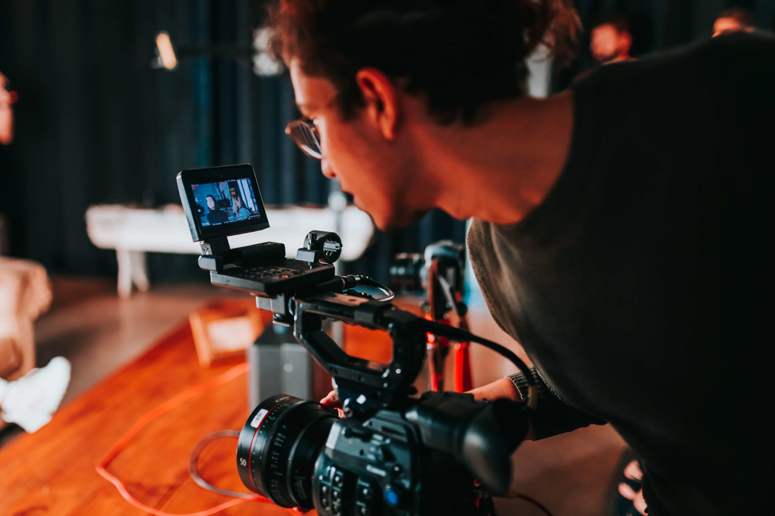
    #1 Use Diverse Stock Photography and Video Resources

    As marketers, we should strive to not only include minority groups and POC in our creative, but we should also be thoughtful about how these communities are portrayed in photos and videos. Who is leading the meeting? Who is teaching the class? Who is in handcuffs? If the answer to these questions could perpetuate any stereotypes—no matter how subtle—consider skipping those assets and continuing your search.

    The mere presence of underrepresented communities is not enough; we must make sure they are represented positively and in a way that would make members of said communities proud. Nappy.co is an excellent free resource for photos of Black and Brown people and a great jumping off point for diversifying your photo library.

    Example of diverse vector art for a marketing campaign

    #2 Adapt Vector Art

    Illustrations may seem more straightforward, but will actually require the designer to be just as, if not more, thoughtful as when selecting stock photos. Whether starting from scratch with an illustration or purchasing stock vector art, the considerations are the same. Just as with stock photography, we want to:

    • Avoid perpetuating any stereotypes, not only in subject matter, but also in more subtle ways.
    • Pay extra attention to how facial features, hair, or skin tones are depicted.

    Even in anthropomorphized objects, these considerations need to be prioritized. A design choice may be unintentional or innocuous, but they can have serious implications and reveal damaging subconscious biases. In 2017, a Kellogg’s Corn Pops box depicted a community of corn pops, and the one brown corn pop in the entire group was depicted as a janitor. Kellogg’s understandably faced serious backlash for the illustration and quickly corrected and reprinted the box.

    Luckily, illustrations (unlike photography) are adaptable. Obviously creating vector illustrations from scratch allows the designer to create any scene they want, but stock vectors are also fully customizable, too.

    • These file types usually include .ai, .eps, or .svg files that can be edited in graphics editing software like Adobe Illustrator.
    • Body types, skin tones, facial features, clothing, positioning, and so much more can be edited to represent people of all races, genders, body types, ages, and abilities in various settings.

    #3 Expand Audio Talent Search

    Marketers can’t deny the prevalence and effectiveness of video in marketing and advertising, so a company’s journey to diversifying their creative should not stop at visual assets. In recent years, there has been a push in Hollywood to cast POC voice actors to play non-white characters. While this is a move in the right direction, diversity in voice acting for marketing can be taken a step further.

    Traditionally, women were hired for voice-overs about fashion and beauty, and men were hired for voice-overs about beer and cheeseburgers. We are seeing a cultural shift in household dynamics, where men and women are making important decisions together.

    Adweek estimates that today, 85-90% of voice-overs are done by women across categories, reinforcing that women have more power over the wallet and decision making than originally thought. No matter the industry, marketers should seek out POC voice actors if their videos contain POC characters, and should keep in mind that actors of any gender can be persuasive and appropriate for their videos.

    Purchasing existing diverse creative assets can seem like a daunting task for companies on a budget, but becoming aware of what resources are out there and leveraging additional options for inclusivity is key.

    Stock assets are often thought of as cheesy, unnatural, and overwhelmingly white, but this is not always the case! Marketers must explore diverse stock photo and video options, edit purchased or custom illustrations to be more diverse, and hire diverse voice actors if they want their campaigns to be more effective and reach a wider audience.

    Every organization is different, and not everyone has a dedicated marketing team with the expertise needed to source or create diverse assets. When you work with Search Influence, you’ll leverage our team’s expertise to create diverse and inclusive content for your marketing campaign. Connect with our experts today to discuss your digital marketing goals.

    Sources

    nappy.co

  • Graphics Checklist: High-Quality Assets You Need to Promote Your Business

    Key Insights

    • Businesses need current and high-quality location, team, event, product, and service photographs and logos to establish trust and authority on their websites and across digital and print campaigns.
    • With a well-thought-out plan of action, building out a high-quality asset library does not have to be expensive, time consuming, or intimidating.
    • You cannot use low-resolution photos across all platforms. Marketers need original, high-quality photo, video, and logo files.

    Person behind a video camera gathering assets for a business

    One of the biggest challenges businesses face when developing marketing campaigns is not having enough high-quality photography and video assets for the products, services, or events they want to promote.

    It might be tempting for a company to use whatever photos or videos they have on hand, but low-quality assets are unlikely to attract a steady stream of qualified leads. Using consistent, quality visual assets across all platforms and social channels communicates authority, trust, and professionalism to customers and prospects.

    This post will help businesses understand what visual elements are required in order to create an effective online presence, and how to use those assets effectively in a variety of campaigns. Use our checklist to audit your visual library and understand where and how to make improvements.

    What Are the Minimum Requirements for High-Quality Assets?

    Businesses should use their logos, videos, and photos throughout their websites and across all digital and print campaigns. This includes social media profiles, directories, and ads.

    As a general rule of thumb, it’s always better to have images and videos that are as large and high-resolution as possible! Assets can always be scaled down, but enlarging a photo or video that’s too small isn’t possible without pixelation or distortion. Contrary to popular procedural dramas, if a photo is low-resolution, there is no way to magically “enhance” this photo and render it usable across all platforms.

    1. For any digital campaigns, photos, and videos should be at least 1,080X1,080 px (pixel) with a 72 ppi (pixels per inch) resolution.

    • We recommend 1,080 pixels since we often run Facebook ads, and this size aligns with their minimum image size requirements.
    • Facebook ads have the largest minimum size requirements of any ad platform. By meeting these minimum requirements, businesses can cover their bases everywhere.

    2. Your website should have a hero image—a large visual element (either photography or video) that a visitor sees on your homepage. It should represent the site’s most important content.

    • The hero image can be static or dynamic, such a set of rotating images.
    • Your website’s video or photo hero image should be a minimum width of 1,600 pixels, but ideally 2,000+.

    3. For print assets, photos need to be 300 dpi (dots per inch).

    • Since images displayed on the web are 72 ppi, the only way to print them at full resolution is to print them very small.
    • A 600×300 px image from the web at 72 ppi, for example, can only be printed at 2×1 inches.

    4. Logos are an exception to the rules above.

    • The largest that a logo will appear in a campaign is 1200×1200 px, so we recommend a logo that will be easily viewed at this size without having to scale it up to avoid distortion.
    • Logos with transparent backgrounds are more versatile; plus, Google Responsive Display Ads specifically recommend logos in this format.
    • GIF, PNG, and SVG file formats support transparency.

    What Makes an Asset Relevant for Your Business?

    1. Photos should cater to a business’s target audience. Photos of products on plain backgrounds are great for an online shop, but photos and videos of people actually using the promoted products or services make for much better ads.

    2. Interior and exterior shots of the business’s physical location are ideal for search engine listings, directories, ads, and websites.

    • These photos can also help users find a storefront while using Google Maps, especially if the default street view is somehow obstructed or inaccurate.
    • 360 photos allow potential customers to interact with Google Maps listings, and they can be taken professionally or with a special camera.

    3. Having photos of the current staff as a group and individually with the same background is necessary for “About Me” pages and helps potential customers connect with your business on a more personal level.

    Keep in mind that most campaigns will need fresh images rotated over time, so depending on the goals of the campaign and what’s being promoted, more photos or videos may be needed every three to six months.

    Cartoon of person checking off giant list with a giant pencil

    Checklist

    Determine the assets needed by campaign:

    1. All campaigns need a logo file.

    • Ideal file formats are AI, EPS, SVG, PSD.
    • A PNG with transparent background is acceptable, and JPG/JPEG files are OK.
    • The minimum size should be 1,200 x 1,200 pixels.

    2. SEO campaigns require external and internal photos/videos of your location(s), as well as photos of your team.

    • The minimum size required in an SEO campaign will vary, but the bigger, the better!

    3. Facebook Display, Google Display, social media management, email, and blog campaigns require photos/videos related to the products, services, or events being promoted and photos/videos that are applicable to the audience being targeted.

    • Product photos are best when taken on a plain background at the same angle.
    • Team photos are best when taken with the same background.
    • Larger photos are always preferred, and these campaigns typically require a minimum size of 1,080 by 1,080 pixels.

    4. Print campaigns require any relevant product, location, event, service, or team photos with at least 300 dpi resolution.

    Gather existing assets:

    1. Have you worked with a photographer or videographer in the past? Make sure all of these assets are easily accessible and organized.

    2. What types of assets do you have?

    • Take inventory of your assets by organizing them into categories.

    Make arrangements to acquire additional assets if your current assets do not meet the above criteria:

    1. Logo files can usually be recreated in a more scalable or higher resolution file format, but this is harder with more complex logos.

    2. Thumbtack is a great resource for affordable professional portrait, location, 360, event, and product photography.

    3. If professional photography is still not within scope, head to free stock photography sites like Pixabay or Pexels.

    High-quality visual assets elevate not only your digital and traditional marketing campaigns, but also your overall online presence. You can easily arrange for professional photography and videography, or contact Search Influence to discuss asset creation and developing your asset library.

    Images

    Camera

  • How to Best Utilize Facebook’s 3D Photos for Your Brand

    Facebook introduced 3D photos in October 2018, and users have been posting these fun “window views” that give viewers a new perspective on once-flat photos in their newsfeed. Originally only available to those with an iPhone with Portrait Mode, 3D photos can now be uploaded by anyone with a dual-camera smartphone or by anyone who had manually created a depth map.

    This new format saw some traction right after its launch, but has slowly plateaued in popularity over the year. This could be due to it only being available to certain iPhone users at first, or maybe just a general lack of awareness of the feature, but, either way, this means brands that do utilize it will stand out in newsfeeds even more.

    Why Use 3D Images in the First Place?

    Any new feature that Facebook introduces is inherently attention-grabbing, and 3D images have the best of both the video and flat image worlds. The eye-catching movement is automatic as the user scrolls through their feed, but taking in a 3D image doesn’t take as long as watching a video. This immersive experience offers a self-guided glimpse into a “window.”

    The feature was released for users, not pages or brands, to share photos. However, users have found that if they can post 3D images from their personal accounts, they can post them from business accounts too. With this workaround, business pages are able to blend in more with their audiences’ newsfeeds, behaving and looking more like their friends and family.

    As older smartphones are phased out, 3D images will likely become even more common on newsfeeds. A brand that gets ahead of the trend before it really takes off will prove itself more innovative than its competitors and establish more authority with its followers.

    How to Use 3D Images

    More casual images will look the most natural when using this feature. Your audience will be scrolling through their newsfeeds expecting the 3D image to be posted by someone they actually know, so keeping this in mind will help your brand seamlessly blend. The post below, for example, was posted by the official Bud Light Ritas Facebook Page and looks like it could have been posted by anyone celebrating the weekend or watching some football.

    Facebook example for a brand using 3D images in advertising

    If you have creative that was created NOT using portrait mode on a smartphone, you can still manually create a depth map, too. This is a bit more challenging and time-consuming, but it’s completely possible to make a 3D photo in Adobe Photoshop or with other online tools. Get creative with your creative!

    Tips for Taking Great Portrait Mode Photos

    • Put a few feet in between the camera, the subject, and the background. To highlight the depth in the photo, there needs to actually be depth.
    • Make sure the subject of your photo contrasts with the background. Don’t have a woman wearing a green sweater against a green wall.
    • Transparent or shiny objects, like glass or windows, can confuse the depth sensors and might turn out distorted. This may also happen with hair. Combining these two, like a person standing in front of a wall of glass, may totally warp the photo.

    Making the most of recently released features is a great tactic for drawing users in on social media. At Search Influence, we’re always looking for new ways to make our clients’ marketing campaigns more effective. To learn more about using advertising to grow your business, start a conversation with our marketing strategists.

  • How to Create Effective and Engaging Video Content on a Budget

    In 2019, it’s impossible to deny the importance of video content for businesses. Visitors spend 2.6 times more time on pages with video, and websites with videos are 53 times more likely to reach the front page of Google than ones without. 95% of the message is actually retained from a video (as opposed to only 10% of information read via text) and a whopping 85% of consumers want to see more video content from brands. The evidence that video is going to dominate the marketing world for the foreseeable future is everywhere, and it’s exciting!

    We’re going to give you a few tips below to help you create optimized videos that won’t break the bank.

    Visual representation of good video implementation on site

    Tip 1: Choose a Style and Tone for Your Video

    The tone of your video can make or break how it’s received by your viewers and ultimately your ROI, and since some marketing professionals consider video to be the type of content with the best ROI, you need to choose wisely. If you’re making an informative video about wills and estate planning, you’ll probably want to take a more serious approach. This not only goes for the content of the video but the animation style, too. You don’t want to use an animation style that’s too playful for your subject, but you also shouldn’t use an overly professional video style for more fun and casual content.

    Tip 2: Appeal to Your Audience’s Emotions

    Instead of focusing narrowly on your product or service, you should also try to appeal to the emotional side of the viewer by focusing on the mission of your product or company. Focusing on a story will connect more to the user subconsciously, which is how 95% of all purchases are made.

    Tip 3: Utilize Existing Content

    Two examples of video production products

    Making videos in-house will save you a lot of money, and you don’t need to be an experienced filmmaker or video editor to make quality marketing content. There are plenty of resources out there that don’t require any special software to use. Powtoon, for example, is a great resource for creating animated videos. Multiple different animation styles are available to choose from that can work for any industry or topic.

    Another helpful video creation resource is Promo. Promo provides free music and live action and animated video clips that you can combine with text or your own footage and audio. You will save countless hours by using what is already available to you on these and other platforms.

    Tip 4: Focus on the First Ten Seconds

    It is essential to grab your viewers’ attention in the introduction of your video. A fifth of all viewers will stop watching after ten seconds if their attention is not captured in the first ten seconds. You have until the 30-second mark to engage your viewers or you’ll lose 33% of them, and one minute until you lose 45%. You need to know your audience well enough to know what will stand out to them enough to stop scrolling and pay attention throughout your whole video. Once they do make it to the end of the video, a strong CTA is just as important as those first ten seconds. Choose something specific like subscribing to a newsletter or visiting a page on your site.

    Tip 5: Optimize Your Video for SEO & Mobile

    Over half of all videos on the web are viewed on mobile. Of those mobile viewers, over 90% of them share video content with others. The potential shareability of videos viewed on mobile is not something to be ignored, and which is why you need to optimize your videos for mobile. The standard aspect ratio for videos viewed on desktop is 16:9, but this is not ideal for mobile as it does not show up big enough on the screen. Ideally, videos optimized for mobile would be designed with a 9:16 aspect ratio so that they fill the entire screen. To ensure your video is viewed well on both desktop and mobile, create a square video with a 1:1 aspect ratio. For Facebook, your videos should have both captions and audio. This is not required, but it is recommended, as 85% of videos on Facebook are viewed without sound.

    Animaker is just one resource available to you that allows you to create vertical videos tailored specifically for mobile viewing.

    According to the digital marketing institute, you should be hosting your video on your own domain: “enable embedding on your video as this will help you increase the likelihood of receiving inbound marketing links,” and make sure your descriptions and keywords are thorough and unique to the video you created. Video can drive up organic traffic as much as 157%, so you need to make sure your video is optimized for SEO.

    These tips should help get you started on creating and optimizing your own video content in-house. If you should still need some SEO guidance on making sure the right people and customers are seeing your video content, the team at Search Influence can help. Contact us today to get started.

  • Everything You Need to Create an Effective Landing Page—and Everything You Don’t

    If you have run any type of digital marketing campaign for your business, you’ve probably come across the term “landing page.” But what exactly is a landing page, and what role does it play in helping to convert leads into customers? Simply put, landing pages are the pages where users “land” after clicking on an ad from Google, Facebook, or a similar platform. When done right, they feature persuasive and highly relevant content, focused on one specific conversion. By directing users to a landing page rather than simply the homepage of your website, you can ensure that you are able to attribute leads to a specific campaign while simultaneously providing a better answer to the search inquiry of the user. A landing page should be specifically focused on lead generation, and these tips will help you have the highest conversion rates once users make it to your page.

    Do Have a Compelling Call to Action

    A clear call-to-action(CTA) is the most important part of your landing page and should clearly communicate what you want your reader to do on the page. This could be to register for an event, download an eBook, or schedule a consultation. Whatever it is, it needs to stand out from the rest of your content and be one of the only, if not the only, actionable items on your landing page.

    If your CTA is a form instead of a button, the title of your form should be much more specific than a simple “Contact Us.” Entice your readers with simple, yet descriptive language like “Register to Get Your Free Marketing eBook” instead. For buttons on your form, avoid generic language like “Send” or “Submit” and instead use language like “Get My Analysis” or “Start My Free Trial.”

    Graphic of a form field on a landing page - Search Influence

    Users are also typically skeptical to give out more information than necessary, so you don’t need to ask for their full name, address, phone number, date of birth, where they went to high school, and their mother’s maiden name if all they’re doing is downloading an eBook. A user is much more likely to actually fill out the form if you keep it short and sweet. Sticking with essentials like their name and email may be all you need.

    For more tips on how to craft stellar CTAs that will convert, check out this blog post.

    Don’t Cram Everything Above the Fold

    We’ve all heard for decades that readers rarely make it below the fold (originally used in reference to traditional newspapers), and that we should try to cram everything important above the fold. This doesn’t hold as true today as it once did, and cluttering the top section of your page can actually hurt your conversions. While it is still true that some users won’t make it below the fold at all, if what you have above the fold is compelling enough to grab their attention, they will scroll down to read the rest of your content. So while, yes, you do still want your CTA and most important information above the fold, try to limit it to just that. No one wants to read anything that is a cluttered mess, and you’ll retain users’ attention much better by avoiding the clutter.

    Visual representation of above-the-fold content on a landing page - Search Influence

    Do Have Fast Loading Speed

    A fast page load time is absolutely essential for any web page. Users expect a page to load within seconds, and if it doesn’t, they often abandon the page entirely. In fact, a case study from Hubspot found that a 1-second delay in site speed resulted in a 7 percent reduction in conversions. Images and videos often slow down page load time, so be sure to optimize elements like these to avoid losing users. Luckily, you can test out the load speed of your page and address any concerns.

    Don’t Have Endless Content or Jargon

    You don’t want to confuse any potential leads with overly complicated, industry-specific jargon. You should be able to demonstrate your expertise in your field without intimidating or annoying any of your users. While you want to give enough information to draw a user in, you don’t want to overwhelm them with too much information up front. If you do have longer content, try breaking it up with bulleted lists or by using icons.

    Icons used in a landing page - Search Influence

    Do Include Images and Videos

    According to Unbounce, videos can increase conversions by about 80 percent—making them a worthwhile investment for your page. Since videos are often quite big and the play buttons can distract from your CTA, consider making your video considerably smaller than the standard minimum of 960px by 720px, with the option to make the video bigger when it’s actually playing.

    Example of video used in a landing page - Search Influence

    If you don’t have a relevant video for your page, strong visuals are still extremely important. Avoid stock photography whenever possible, but it’s still better to have stock photography than no imagery at all. Users also respond better to images with faces in them than images without.

    Photos aren’t the only type of imagery you can utilize on your landing pages. Depending on the industry, your target audience might respond well to vectors or illustrations, which can also help explain complex subjects when photos aren’t available.

    Example of vector graphics used in a landing page - Search Influence

    Whatever imagery you do end up using on your page should be consistent with the display, Facebook, or any other type of ads that are driving users to the landing page in the first place. When a user clicks on an ad with vector images, for example, they would expect the following landing page they land on to have similar imagery. If the look and feel of the page is completely different than the ad they clicked on, the user could be confused and think they clicked on the wrong ad altogether.

    Don’t Include Navigation

    While it may seem counterintuitive to exclude typical site features like a navigation bar, for landing pages, you actually want to include as few opportunities to leave the page as possible. This includes navigation, which can also be distracting and take away from your main call-to-action.

    Do Conduct A/B Testing

    Once you’ve got your pages built, you should conduct A/B testing by changing out elements of your page to determine what performs best. While audiences typically respond more positively to people in images, for example, maybe yours responds better to objects or vector illustrations. You should also test out CTA placement, button colors, font choices, and content. Keep in mind what you learned in science class though, you only want to change one element at a time when performing these tests. If you change multiple variables at once, you won’t have accurate data on which elements are actually making the page perform better or worse.

    Creating landing pages that convert is no easy feat. Unbounce estimates that achieving a 12 percent conversion rate for your landing page will place you above 90 percent of the competition. With a comprehensive online advertising strategy, every step of the process will be clearly catered to your target demographic, making it as easy and risk-free as possible for users to take action. If you want help creating your online presence, reach out to Search Influence to receive your custom marketing analysis.

  • Here Are 10 Eye-Catching Medical Display Ads That Worked

    1609-SI-TheInfluencer-KL-A-04

    Need a little inspiration for your practice’s online ad campaign? The following medical display ads are some examples of online advertising at its finest. They boast an impressive balance of striking imagery, audience targeting, creative calls-to-action, and concise copy.

    These advertisements from Stewart Dermatology and Dr. Grant Stevens, FACS, at Marina Plastic Surgery utilize close-ups of women, which grab the attention of viewers more effectively than the alternative. Consider using real people in your ads to appeal to more potential patients.

    #1: Stewart Dermatology
    1

    #2: Dr. Grant Stevens

    2
    You can also target specific audiences to yield even better results for your online ads. For example, these ads from Gleevec and Allure Dental could target people specifically in New York or specifically adult males seeking dental or orthodontic work.

    #3: Gleevec

    3


    #4: Allure Dental

    4
    Using a creative call-to-action is also essential for conversions. The following ads from Medscape, Dermatology Associates of Wisconsin, S.C., and Hospital for Special Surgery challenge the viewer to do much more than “Click Here.” Consider trying “Request an Appointment” or “See Our Success Stories” on your display ads as a way to challenge your potential patients to more actively engage with your advertisements.

    #5: Medscape

    5


    #6: Dermatology Associates of Wisconsin

    6


    #7: Hospital for Special Surgery

    7


    Short and catchy phrases and slogans can do a great job of getting and holding viewers’ attention. Here are a few examples from Doctors of Osteopathic Medicine, Hass Plastic Surgery and MediSpa, and Coolsculpting: “We treat the woman. Not the symptom,” “Love the memories, forget the lines,” and “Lose the fat. No needles. No surgery. No downtime.”

    These slogans perfectly utilize short, concise phrases that successfully capture the viewer’s attention.

    #8: Doctors of Osteopathic Medicine

    8

    #9: Hass Plastic Surgery and MediSpa

    9


    #10: Coolsculpting

    10

  • How Can Facebook’s New Profile Layout Affect Your Business?

    1608-SI-TheInfluencer-KL-A-03Large

    Facebook recently rolled out a new layout for business pages and the marketing implications could be more than initially meet the eye.

    Profile Picture Positioning

    We’ve all seen clever interactive cover photos with the overlapping square profile image on the standard desktop site. A drink from the cover photo is poured into a glass in the profile picture. A man in the profile picture passes a ball to a woman in the cover photo. A giant cat in the cover photo peers down on a tiny human in the profile picture. The square profile image also acts as quick and effective brand recognition when seen standalone in a newsfeed as well as when viewed on the mobile version of Facebook. But with the profile picture now located in the sidebar to the left of the cover photo, the playful effect of the overlapping images is null and void.

    Example 1:

    Facebook Profile 1

    Example 2:

    Facebook Profile 2

    How Does the Relocation Affect Your Business?

    Although businesses won’t be able to get creative with the overlapping interactive profile images, the relocation of the square profile picture actually frees up a lot of valuable visual real estate on the cover photo that was once covered up by the image, company name, and CTA buttons. Even if you didn’t have interactive profile images on your business page, there’s a lot of space—over 20% of the area of the cover photo to be exact—that was considered off limits for content and is now fair game. Even on the new mobile version of business profiles, the cover photo isn’t covered up by the profile picture or text.

    Additional Sidebar Elements

    Beneath the profile picture, you’ll also see tabs that were once accessible under the cover photo on desktop sites. In the old layout, only a few tabs were visible, with the additional tabs located in the dropdown “More” option. With the new sidebar, however, all of the tabs are now visible. The buttons that were located on the cover photo itself are also positioned right below it, with the main CTA button located on a more eye-catching blue background. This left-aligned navigation also stays in place while the user scrolls down the page.